The Most Common Email Marketing Mistakes We See During Audits
Posted on 9/2/2024
Reviewed by Alex Podmore updated at 9/25/2024
Introduction
Email marketing does not bring new traffic. For that reason, it is often the most neglected channel, especially for smaller businesses.
But that is a mistake - because it helps you get more out of what Google, Meta, SEO and other channels give you. When set up right, email marketing can easily generate up to 30% extra revenue, with no ad spend required.
This post will help you avoid the mistakes we often see when auditing the email marketing of our clients.
1. Tracking Issues
One of the biggest mistakes you can make with email marketing tools such as Klaviyo, the tool we use in our agency, is ignoring tracking and analytics.
You may not need your Klaviyo for insights if you have GA4 set up well. But most essential flows (automated email sequences) are triggered by events. If your events aren’t tracked correctly, your flows will not work, and all the time you’ve spent setting them up will be wasted.
There are several key events you need to monitor:
- Checkout started
- Viewed product
- Placed order
- Add to cart
If you are using Klaviyo’s Shopify integration, the “add to cart” event will not be set up by default. You will need to follow this guide to implement it.
This is also not a “set-it-and-forget-it” task. As you make changes to your website, you need to check the tracking to be sure it’s still working.
2. Missing Essential Flows
Do you have an Abandoned Cart flow? If yes, check the flow trigger right now. Is it “Add to cart” or “Checkout started”?
If it’s the former - you are awesome. If it’s the latter, you don’t actually have an abandoned cart flow. 90% of accounts we audit have this problem, and it’s usually not the only one.
You need to understand the stages of the customer journey we can track in Klaviyo:
- Site visit. They’ve landed on one of your pages that is not a product page. The event telling us this happened is “Active on site”.
- Product view. They have now clicked on one of your products and visited its page. The event is “Viewed product”.
- Add to cart. They have added the product to their cart. The event is “Add to cart”.
- Checkout. Depending how your store is set up, this event can be triggered in two ways:
- When someone clicks the “Go to checkout” button.
- When someone goes to checkout and inputs their email.
In both cases, the event is the same - “Checkout started".
- Purchase- when they have actually placed an order. The event is “Placed order”.
To get the best results from Klaviyo, you need flows targeting people at every stage of the funnel.
- A Site Abandonment flow for those who quit without viewing a single product.
- A Browse Abandonment flow for those who view a product, but do not add anything to their cart.
- An Abandoned Cart flow for those who add a product to their cart, but do not go to checkout.
- An Abandoned Checkout flow for those who initiate checkout but do not finish their purchase.
- A Post-Purchase flow for those who have placed an order. This is a good opportunity for cross-selling.
Your conversion rate will generally be lower for top-of-the-funnel flows. But a few conversions is always better than no conversions.
In addition, you will need:
- A Welcome flow. That’s where you put your initial offer, like a 10% discount on the first order, and introduce the customer to your brand, telling them more about your products.
- A Sunset flow. Not as important to implement right away, this is the flow you will use to either re-engage inactive profiles or suppress them if they do not answer your call. Klaviyo’s pricing is based on your active profiles. If you don’t clean out the dead ones, you’ll pay more.
3. Poor Deliverability
You can have beautiful designs, kick-ass copy and great content, but none of this will matter if your emails land in the spam folder.
To avoid that, you need to maintain a good sender reputation. Although you can’t directly check this like you can with other metrics, there are ways to know if it has been damaged.
The easiest and most reliable way is to check the engagement rates of your welcome flow emails. Specifically, the first email.
If you have a welcome offer (and you should), that email will be the most anticipated out of anything you send. A customer subscribes using a pop-up form and sees a confirmation message saying their discount code will soon land in the inbox - in most cases, they will immediately check their email.
So if everything is good, this email should have a very high engagement rate - 60% or more opens. If you see 40% or lower, your sender reputation is likely damaged and you need to start repairing it. Anything between 40% and 60% is not good, but not necessarily a symptom of bad deliverability - the issue could be in your subject lines.
But how do you make sure it stays good? Here are some tips:
- Make sure the technical setup is done. Add your branded sending domain and all the required DMARC records. Klaviyo will keep reminding you to do this, but some people ignore it.
- Use segmentation and send campaigns to the engaged audience. Most of your campaigns need to have good engagement rates. This does not mean you must never use broad targeting - you can use it for big sales and events. But for more educational content, which should be the majority of your emails, keep the targeting precise and engagement rates high.
- Send campaigns consistently. One of our clients had a sudden drop in attributed revenue - from 30% to 5% - over one month. Only one thing had changed - they had stopped sending campaigns. Therefore all the emails from their flows started landing in the spam folder. So you need to be consistent.
4. Neglected pop-up forms
Almost every client we audit has at least one problem with its sign-up forms. Here are the most common:
- No pop-ups, only a static embedded form. You will never get enough subscribers this way, pop-ups are a must.
- Using the same pop-up design for mobile and desktop. You need different designs, and once you have them you will notice that the subscribe rates for platforms are different. The A/B tests you will be running for these forms will also have different results - something which works on desktop will not necessarily work on mobile.
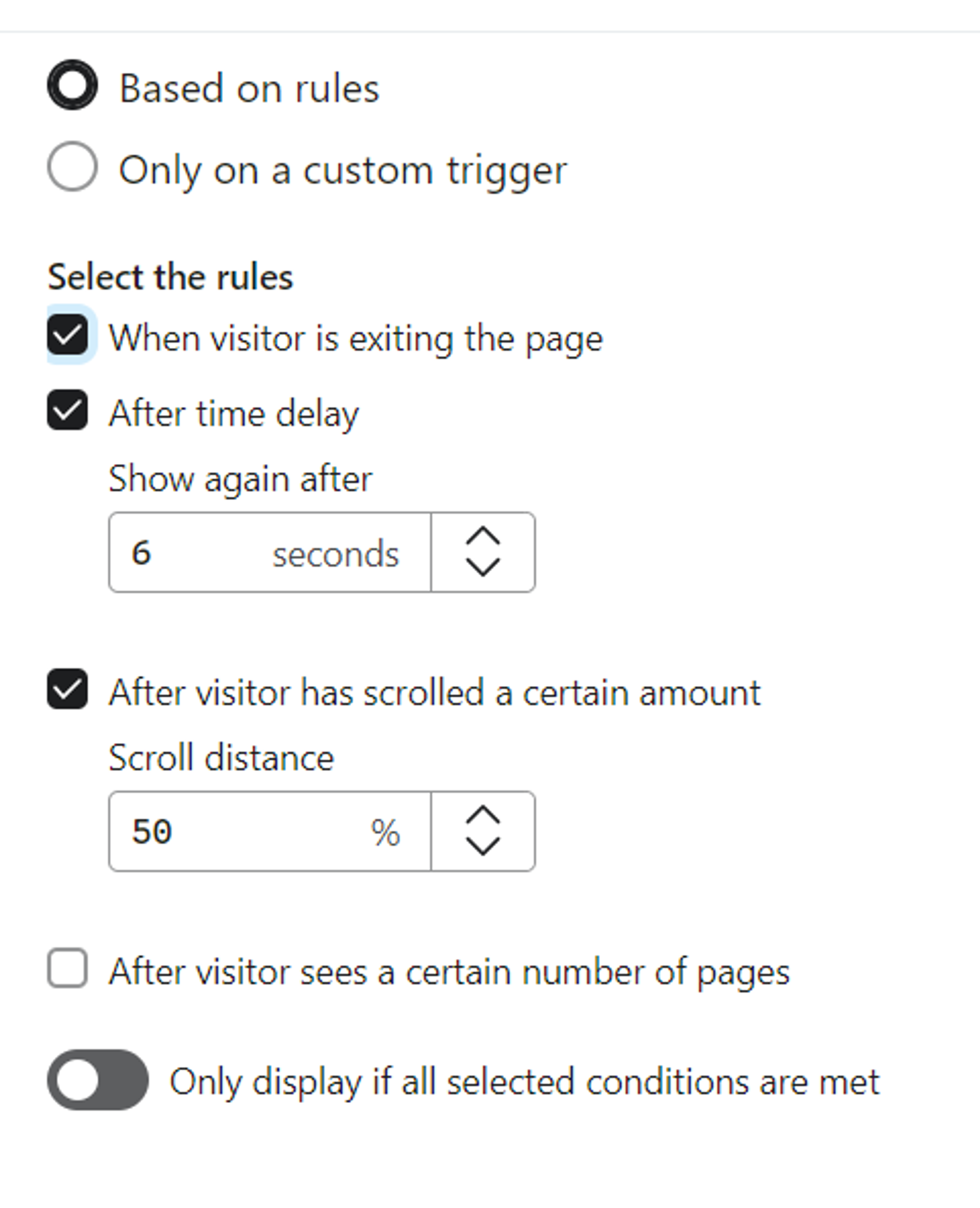
- Problems with targeting pop-ups. Very often, they show up too fast or too late, or on the wrong pages. We recommend using the following targeting settings:

- No welcome offer. You will not get many subscribers if you don’t give incentives to submit the form. 10% off or a flat discount, if you don’t get many return customers, is usually enough.
Once your flows are set up, improving the subscribe rate becomes one of the lowest-hanging fruit. The more subscribers you get, the more revenue your welcome flow and campaigns will generate.
5. Neglected Mobile and Email Client Adaptation
If your beautifully crafted email looks like a mess on mobile, you're losing money.
Over 50% of emails are opened on mobile devices. Ignore this, and you're alienating half your audience.
Here’s a quick mobile optimisation checklist:
- Single-column layout, 600px max width
- Large, tappable CTAs (at least 44x44 pixels)
- 14px+ font size for body text
- Compress images for faster loading
- Short, punchy copy that's easy to skim
- Adequate white space for easier tapping
Aside from that, different email clients render your emails differently. What looks great in Gmail can have visual bugs in Outlook.
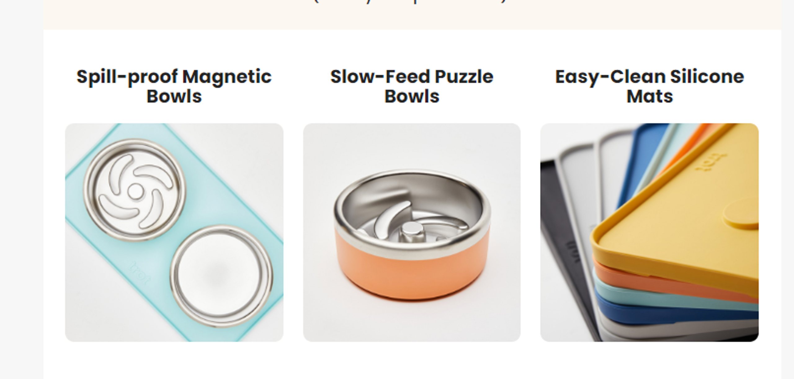
For example, suppose you create an email with a table similar to this, with several images in one row:

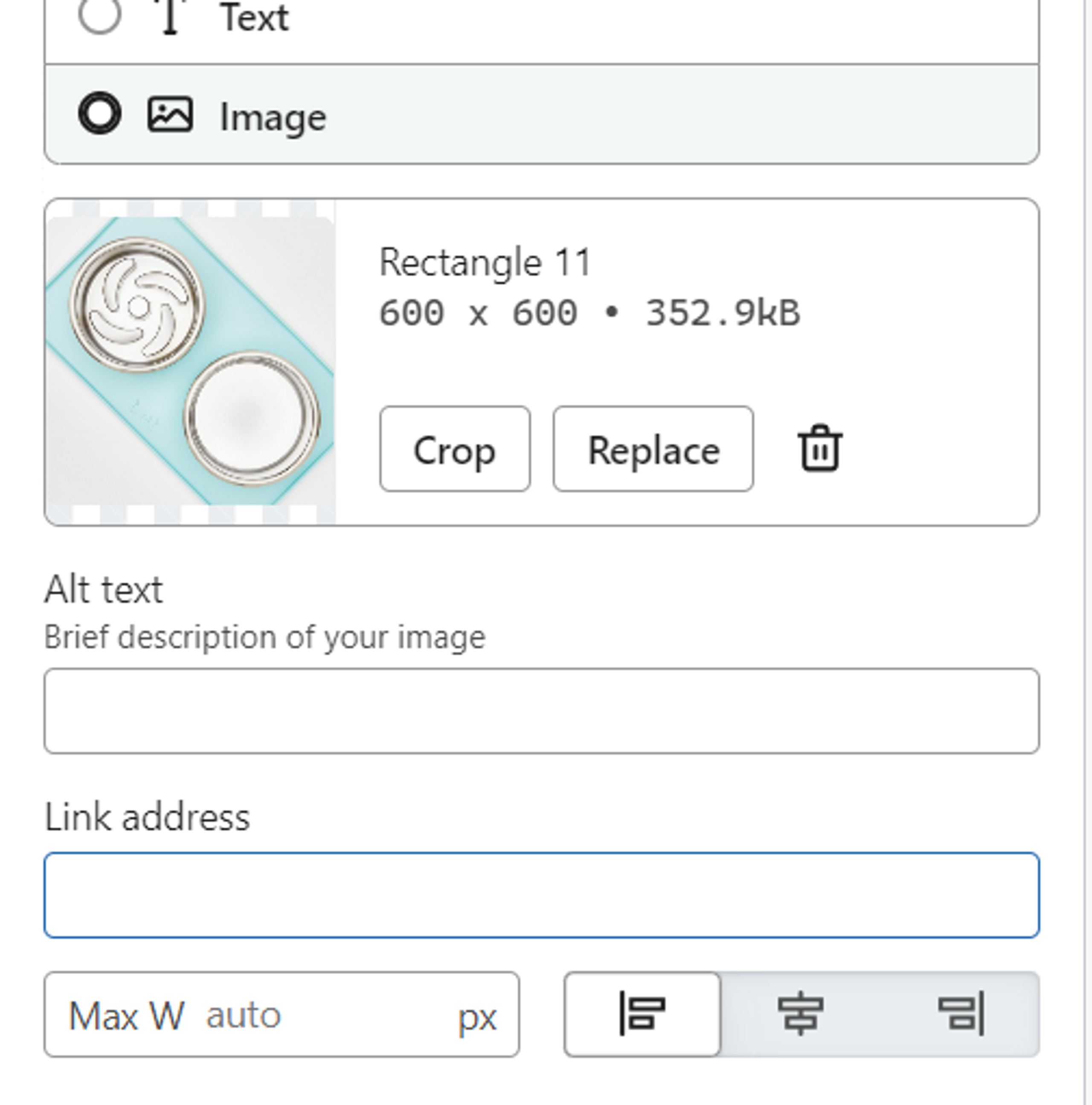
And you leave the images’ maximum width settings on “auto”, as is the default in Klaviyo.

You will not see any issues in Klaviyo’s preview mode, or in Gmail.
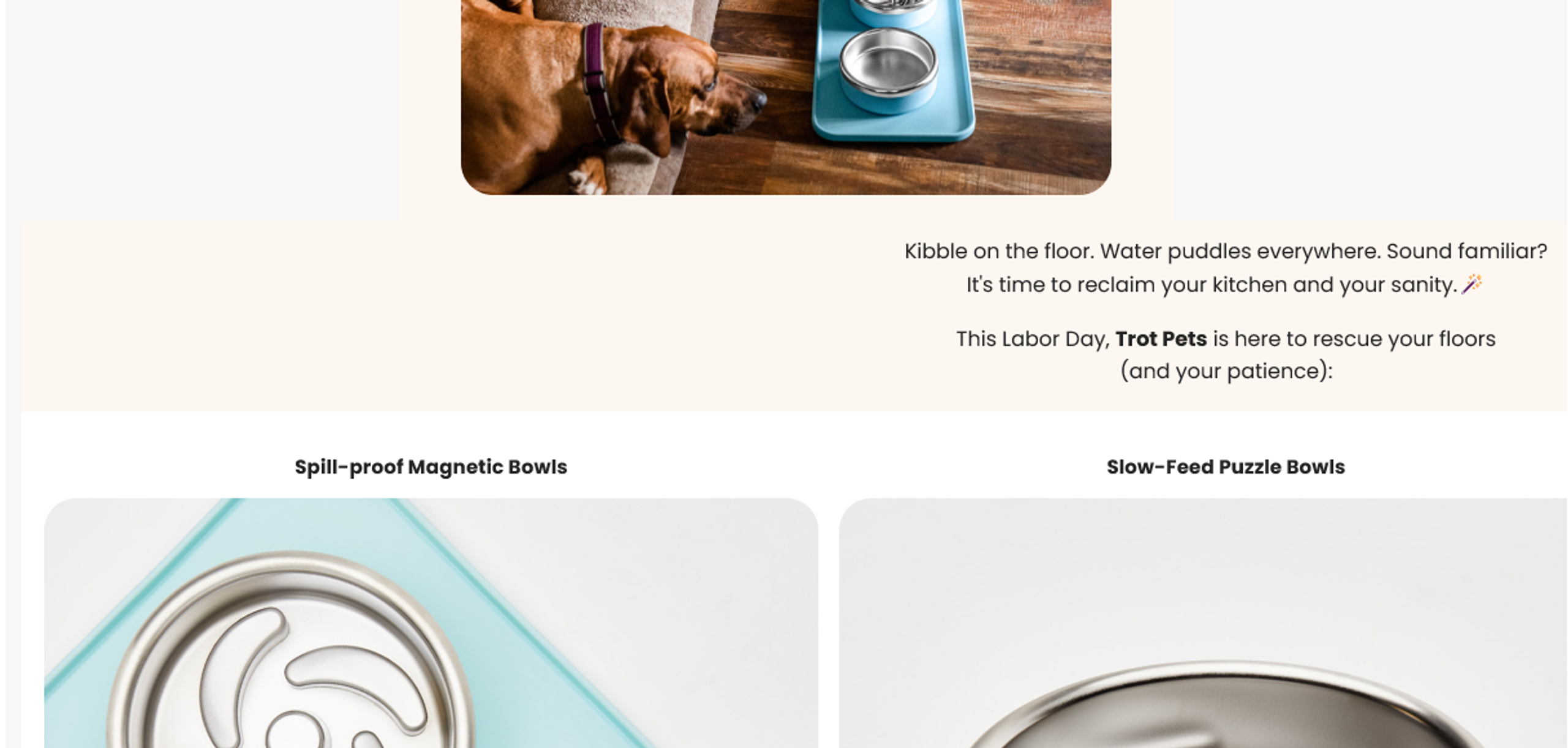
But in Outlook, this email will look like this:

Bottom line? Always test in major email clients before sending.
Conclusion
These common mistakes can significantly impact your email marketing performance. Each error reduces your revenue, engagement and customer loyalty.
However most are easy to fix. Start by auditing your account for:
- Tracking setup
- Essential flows
- Deliverability
- Pop-up forms
- Mobile optimisation
Addressing these issues can dramatically improve your results. Email marketing is an ongoing process, so regularly review your strategies, test new approaches and stay updated with best practices.
