Ecommerce Web Design: How to Make an ECommerce Website that Sells
Posted on 10/20/2023
Reviewed by Arnt Eriksen updated at 11/7/2023
Introduction
If you've been wondering how to create an eCommerce website that sells, the answer is simple - good eCommerce web design.
Even the best marketing team in the world won't help your sales if your website design is poor.
To achieve success in eCommerce, you need to build your customers a golden bridge from the landing page to conversions. In this article, we will tell you how to build an eCommerce website.
What is eCommerce web design?
eCommerce web design is the process of building an eCommerce website to sell products or services online with fewer clicks.
It involves various elements such as visual design, user interface, user experience, functionality, and performance optimization.
Great eCommerce website design aims to create a seamless user experience. It should guide visitors through the sales funnel, from product discovery to checkout. It also incorporates various features that enable online transactions such as secure payment gateways, shipping and delivery options, and order management systems.
In short, eCommerce website design is all about creating online stores that not only look good but also deliver a smooth and intuitive shopping experience for customers.
Why is eCommerce website design important?
Web design plays a critical role in the success of an eCommerce store. In today's digital world, customers expect more than just a functional website that allows them to make a purchase.
They want a seamless, visually appealing experience that reflects the quality of the products and services being offered. Here are some reasons why good web design is essential for building an eCommerce site:
1. Aesthetics matter:
The first thing to keep in mind when thinking about how to set up an eCommerce website is its visual design. The design of an your website can significantly impact customer perception and trust. A visually appealing and professional-looking online store can create a positive first impression. And a good first impression makes customers more likely to engage with the site and make a purchase..
2. User experience impacts sales:
An eCommerce site with a confusing or poorly designed user interface can lead to customer frustration and cart abandonment. By designing a user-friendly and intuitive interface, eCommerce store owners can improve the overall shopping experience. This increases the likelihood of converting visitors into paying customers.
3. Brand identity:
The design of an online store should reflect the brand's identity and values, helping to differentiate it from competitors. A cohesive and consistent eCommerce website design can create a sense of trust and familiarity. Customers will be more likely to return for future purchases.
4. Mobile optimization:
With an increasing number of customers shopping on their mobile devices, mobile optimization is crucial for eCommerce success. A website that is not optimized for mobile devices can be difficult to navigate and may lead to a poor shopping experience, ultimately leading to lost sales.
There are certain features that are common among the best eCommerce website examples. Below, we will take a look at the most important things to keep in mind when creating an eCommerce website.
Web Forms: How to Optimize User Experience
When considering how to build an eCommerce website, you can't forget about the web forms. Web forms are an essential part of eCommerce websites, as they allow customers to input their personal and payment information when making a purchase. However, poorly designed forms can lead to frustration and cart abandonment. To ensure a smooth checkout process, consider the following tips for optimizing web forms.
1. Set clear expectations:
When designing your web form, it's important to set clear expectations for your customers. This includes breaking the form up into logical sections, such as personal details and payment information. By doing so, customers can anticipate what information is required and won't be caught off guard by unexpected requests from your online store.
2. Only ask for information you absolutely need:
It's important to only ask for information that you absolutely need from your customers. Avoid optional form fields whenever possible, as they can create unnecessary friction and distract customers from completing the purchase.
3. If you do have optional form fields, make it clear what’s required and what’s optional:
Optional form fields can be useful for gathering additional information from customers, but they can also create confusion and frustration. To avoid this, clearly indicate which fields are required and which are optional. Consider using a different color or asterisk to visually distinguish between the two.
4. To improve the quality of your leads, intentionally increase form friction:
While reducing friction in the user experience is a primary goal for most eCommerce stores, sometimes you may want to intentionally increase friction in your forms. By making certain form fields required or adding a captcha, you can ensure that the leads you receive are more qualified and less likely to be spam.
5. Have a lot of form fields? Consider multi-step forms:
If your web form has a lot of fields, it can be overwhelming for users to fill them all out in one go. Consider breaking up the form into multiple steps to make it more manageable for users and reduce form abandonment.
6. Include a progress indicator on multi-step forms:
When using multi-step forms, it's important to include a progress indicator. It will help users know how many steps are remaining and how much time they need to complete the form. This can improve the user experience and reduce abandonment rates.
7. Start your form with the easiest form fields first:
By starting your form with the easiest form fields, such as a user's name or email address, you can increase the likelihood that users will complete the form. This also allows users to build momentum and feel a sense of progress as they move through the form.
8. Use radio buttons when there are less than 5 choices and dropdowns when there are more than 5:
Radio buttons and dropdowns can be used for customers to select options such as their preferred payment method or shipping speed. It's important to use radio buttons for choices where there are fewer than five options, and dropdowns when there are more than five. This makes it easier for customers to make their selections quickly and move on to the next step of the checkout process.
9. Pre-fill any form fields you can (e.g. auto-populate city and state by asking for zip code first):
To speed up the checkout process and reduce friction, pre-fill any form fields that you can. For example, asking for the customer's zip code can help auto-populate their city and state information. This can save time for the customer and make the checkout process more efficient.
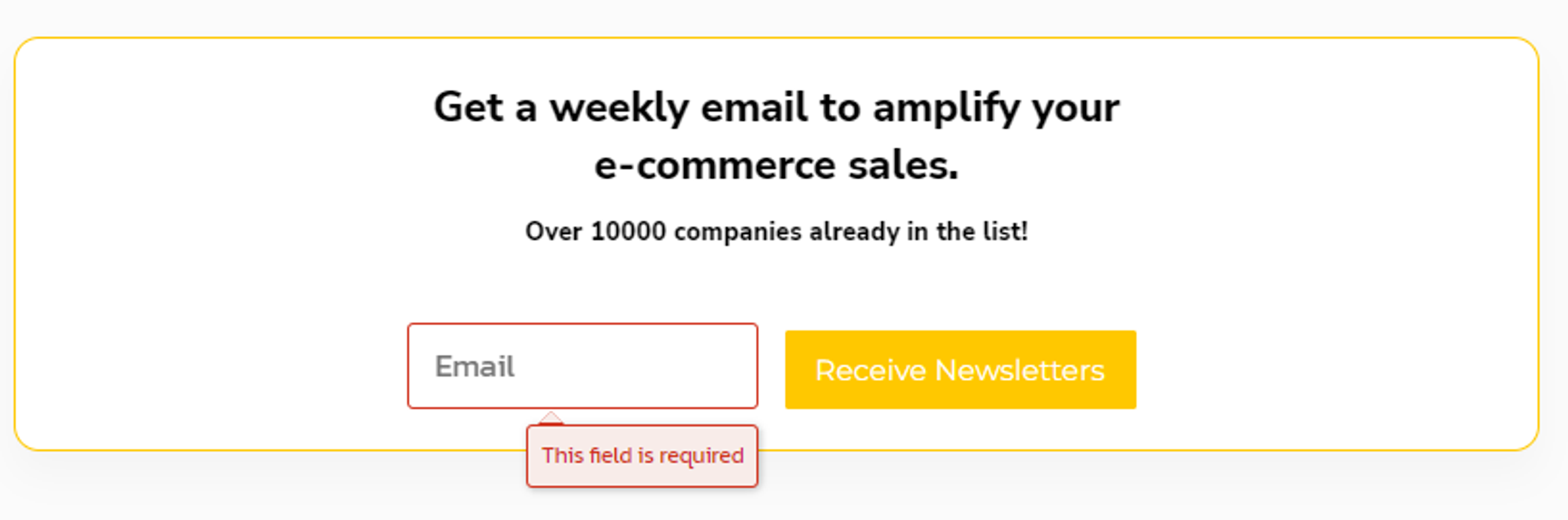
10. Test real-time inline form validation:
To help customers input information accurately, consider implementing real-time inline form validation. This means that as soon as the customer inputs information into a field, the form checks whether it's in the correct format (such as an email address). If the input is incorrect, the form can provide immediate feedback and suggest corrections. This can help reduce errors and increase the likelihood of successful form submissions.
11. Use trust badges in your forms, especially when asking for sensitive information:
Trust badges are logos or symbols that indicate a website's trustworthiness, such as the Norton Secured or McAfee Secure badges. Including trust badges on your forms can help reassure customers that their information is safe and secure. This is especially important when asking for sensitive information such as credit card details. This can increase trust and improve the likelihood of successful form submissions.
Ecommerce Category Pages
Ecommerce product category pages are the pages where customers browse and filter through products. These pages can make or break a sale, so it's important to design them in a way that is intuitive and helpful to the customer. Here are some tips to improve your eCommerce category pages:
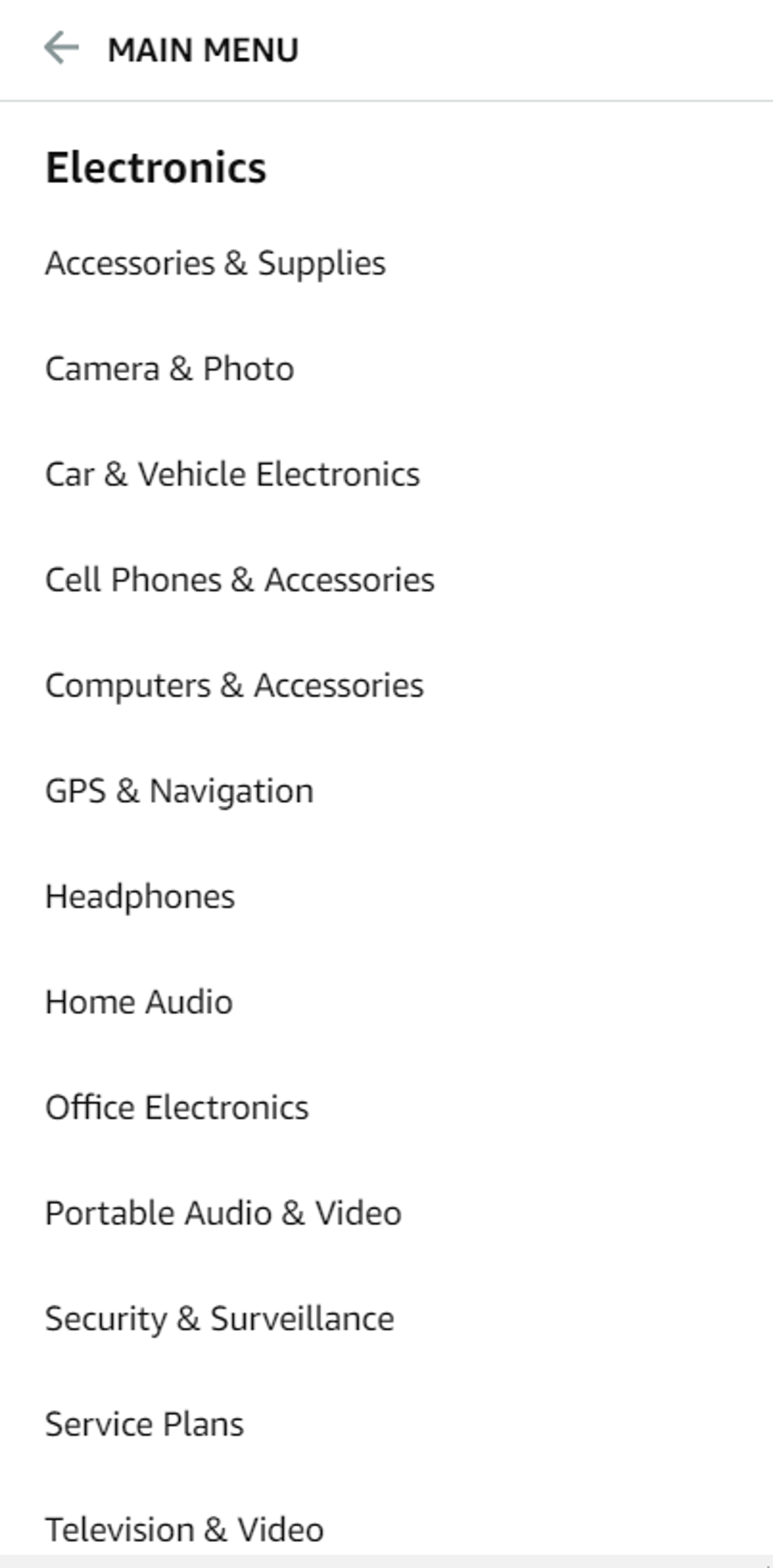
1. Use filters to avoid analysis paralysis and help users make a purchase selection:
One of the biggest challenges of eCommerce product category pages is the overwhelming amount of choices. To help customers narrow down their search and make a purchase selection, it's important to provide filtering options. Filters can include things like price range, color, size, or category. By using filters, customers can easily find the product categories they're looking for without feeling overwhelmed.
2. Use product badges (e.g. “New!”, “Top Rated!”) to highlight certain products and direct users towards a purchase selection (but use them sparingly):
Product badges are small icons or labels that highlight certain products on your eCommerce category pages. They can include labels like "New", "Top Rated", or "Best Seller". These badges can help direct customers towards specific products on your eCommerce store and make it easier for them to make a purchase decision. However, it's important to use product badges sparingly, as too many can become overwhelming and lose their impact.
3. Use sorting tools like price, customer ratings, etc.:
Sorting tools help customers quickly find the products that fit their needs. These tools allow customers to sort products by price, customer ratings, popularity, and more. With sorting options, customers can easily find what they're looking for and make a purchase decision that fits their budget and preferences.
4. Use large, high-quality product and product category photos:
To create an eCommerce website that sells, you need to make your products visually appealing. Visuals are a critical aspect of eCommerce product category pages. High-quality product photos that showcase the product's features and details can help customers better understand what they're buying. This increases the likelihood of purchases when shopping online. Additionally, using high-quality photos of the product category (e.g., lifestyle images) can help set the mood and create an emotional connection with the customer.
5. Breadcrumbs are ideal for navigation and orientation, implement them:
Breadcrumbs are a navigation tool that shows the customer their current location on the website. They typically appear at the top of the page and show the hierarchy of the pages leading up to the current one. By using breadcrumbs, customers can easily navigate back to previous pages and find related products. This can help improve the customer experience and reduce bounce rates.
Buttons and Call to Actions
When you build your own eCommerce website, buttons and calls-to-actions (CTAs) cannot be ignored. The placement, design, and messaging of these elements can have a significant impact on your online business. In this section, we'll cover some tips to help you optimize your buttons and CTAs for maximum effectiveness.
1. The CTA should be highly noticeable, at the top of the page’s visual hierarchy:
Your call-to-action (CTA) button is one of the key elements on your page because it’s what drives conversions. To make sure it’s noticed, it should be placed at the top of the page’s visual hierarchy. This means it should be placed in a prominent location, above the fold, and be visually distinct from other elements on the page.
2. Leave plenty of “whitespace” around your CTAs:
Whitespace is the area around your CTA button that is intentionally left blank. By leaving whitespace around your CTA, you can draw attention to it and make it stand out. Additionally, whitespace can help prevent your page from looking cluttered and overwhelming to the customer.
3. The CTA button color should contrast with the colors on the rest of the page:
The color of your CTA button can have a significant impact on conversions. To make it stand out, the CTA button should be a color that contrasts with the rest of the page. This can help draw attention to the button and make it more noticeable.
Fold and Page Length
When designing a webpage, it's important to consider the fold and page length to ensure that your content is easily accessible and your website is optimized for conversions. In this section, we'll cover some best practices for fold placement and page length to help you create a more effective website.
1. Put the most important content above the fold:
The "fold" refers to the point on a webpage where a user has to scroll to see more content. To make sure your most important content is visible without requiring users to scroll, place it above the fold. This includes things like your value proposition, key product categories, and calls-to-action.
2. People should be able to complete the primary action on any page without having to scroll down:
This is especially important for yourproduct pages and checkout flow. Make sure users can add products to their cart and initiate the checkout process without having to scroll down the page. This can help reduce friction and increase conversions.
Ecommerce Signups
In eCommerce design, it's important to consider the signup process for users. Making it easy and streamlined can help improve conversion rates and reduce cart abandonment. In this section, we'll explore some tips for optimizing the signup process on your eCommerce website.
1. Always offer guest checkout:
Many customers are deterred by the thought of having to create an account just to make a purchase. By offering a guest checkout option, you can reduce friction and improve your conversion rate. If you do offer an account creation option, make sure it's clear that it's optional and not required.
2. Avoid the word “register”. ‘New customer” or similar terminology performs better:
The word "register" can be off-putting to some users, as it implies a level of commitment or effort. Instead, using language like "new customer" or "sign up" can be more welcoming and encouraging to users.
3. Offer account creation after checking out on the Thank You page:
If a customer does choose to create an account, it's best to offer that option after the purchase has been completed. This way, you can reduce the risk of cart abandonment and improve the chances of the customer coming back for repeat purchases. The Thank You page is a great place to offer this option, as it shows that you appreciate the customer's business and are offering them an easy way to come back in the future.
4. Incentivize account creation e.g. “Save your details and get 20% off on your next order”:
Customers may be more likely to create an account if there is an incentive to do so. For example, offering a discount or a coupon code for their next purchase can encourage them to sign up. This can also help to create repeat customers and increase customer loyalty.
5. Offer the option to register using social login:
Customers may not want to create a new account and remember another set of login details. Offer an option to register using their existing social media accounts such as Facebook, Google, or Twitter. This can make the process much easier and quicker for them. This can also provide the added benefit of giving businesses access to more customer data, such as their social media profiles and interests. Your targeted marketing will benefit from it.
Incoming Phone Leads & Tracking
Effective phone lead tracking can help you understand the success of your marketing strategy and make data-driven decisions to optimize your campaigns. By following the tips outlined below, you can increase the number of phone leads and ensure that you're tracking them effectively.
1. Putting your offer in two places:
Putting your offer both above and below the fold can help increase the chances of users seeing your offer and encourage them to call. This is especially important for mobile users who may not scroll down to see the offer.
2. Using a unique number on all channels
This can help track the effectiveness of each marketing channel, enabling you to make better decisions about where to allocate your marketing budget. This includes using a unique phone number for each marketing campaign or channels such as Google Ads, Facebook Ads, or organic search.
3. Set up Google Analytics tracking
If call tracking is not possible, creating a "click to reveal" phone number and tying it to a Google Analytics event can provide some insights into how many users clicked the number to call. It's not as accurate as using call tracking, but it can provide some basic data to help you evaluate the effectiveness of your phone lead generation efforts.
Persuasive Design

Persuasive design is all about creating an eCommerce website that motivates users to take action, such as making a purchase, signing up for a newsletter, or filling out a contact form. Here are some design examples that will help you design a persuasive website:
1. Minimize the visual complexity of your site design:
Users are more likely to engage with and trust a website that is easy to navigate and visually uncluttered. By minimizing the visual complexity of your website design, you can create a more enjoyable user experience. Visitors will be able to focus on the most important elements of your site. This can be achieved by simplifying your site's layout, using a consistent design throughout, and reducing the number of elements on each page.
2. Maximize prototypicality:
Users tend to prefer designs that are familiar to them, so it's important to create a site that follows common design patterns and conventions. This can help visitors quickly and easily understand how to navigate your site and find the information they need. For example, placing the navigation menu at the top of the page and using icons that are commonly recognized can help visitors feel more comfortable and confident. This can be implemented quite easily by using ready-made website design templates from an eCommerce platform of your choice.
3. Create a clear visual hierarchy that corresponds to the most important elements on the page:
A clear visual hierarchy can help guide visitors' attention to the most important elements on your page, such as the main headline or call-to-action button. This can be achieved by using larger font sizes, contrasting bright colors, and whitespace to create a natural flow and emphasis on important elements. By creating a clear visual hierarchy, you can help visitors quickly and easily understand the purpose of your page and take the desired action.
4. Placing the value proposition and call to action above the fold:
When a user lands on your eCommerce website, they should be able to quickly understand what you're offering and what they can do next. This is where a clear value proposition and a prominent call to action come in. Make sure they're placed above the fold, which is the part of the page that's visible without the need for scrolling.
5. Using photos of people on your site? They should be smiling, but not in a cheesy way:
Adding photos of people can help create a connection between the user and your brand. However, you should be mindful of the emotions that those photos convey. Photos of smiling people can help create a positive atmosphere, but you should avoid using photos that look overly staged or fake.
6. Avoid paragraphs that are more than four lines of text:
People tend to scan web pages rather than read them in full. If you present large blocks of text, users may quickly lose interest and navigate away from your site. Breaking down your content into smaller paragraphs makes it easier to read and can help keep users engaged. As a general rule, aim for paragraphs that are no more than four lines long.
7. Use visual cues to direct people towards the page’s most important elements:
Visual cues are elements that draw attention to certain parts of a page. They can include arrows, highlights, color contrasts, and other techniques that make important elements stand out. Implementing these visual cues into your eCommerce website design can help guide users toward the most important parts of a page, such as calls to action or product listings.
8. Maximize the size and quality of product images:
People want to see what they are buying, and high-quality images can make a big difference in the decision-making process. Use large, high-quality product images that show the product from multiple angles and in different contexts. Consider using zoom or hover-over functionality to allow users to see more detail. Also, be sure to optimize your images for web use so that they load quickly and don't slow down your page.
9. Aim for one action per screen:
When designing a page, it's important to think about what the user should be doing and what the primary action should be. To avoid overwhelming users with too many options, aim to focus on one main action per screen. This could be adding a product to the cart, filling out a form, or clicking through to another page. By simplifying the user's choices, you can help increase the likelihood that they will take the action you want them to take.
Typography and Content

Typography and content are critical elements that you should keep in mind when setting up an eCommerce website. They affect the readability, usability, and overall aesthetic of an online store. Here are the important principles to keep in mind:
1. Don’t go smaller than 16px for body copy:
Small fonts can be challenging to read and lead to eye strain, especially on mobile devices. Make sure your font size is at least 16px for body copy to ensure readability.
2. Use traditional fonts (Arial, Georgia, Tahoma, etc) for body copy:
Traditional fonts are widely recognized and familiar, making them easier to read and understand. Avoid using trendy or overly stylized fonts for body copy, which can be difficult to read and distract from the content.
3. Break up walls of text with: lists (ordered and unordered), images, subheadlines every 1-2 paragraphs, and/or paragraph breaks every 3-4 lines:
Large blocks of text can be intimidating to readers and can deter them from engaging with the content of your eCommerce site. By breaking up text with visual aids like lists, images, and subheadlines, you can make the content more approachable and increase engagement. Paragraph breaks every 3-4 lines can also make the text more scannable and easier to read.
4. The optimal line length is 50-75 characters:
Line length can have a significant impact on readability. Text that is too wide can be difficult to read, while text that is too narrow can feel cramped and confining. A line length of 50-75 characters is optimal for most people and makes reading easier.
5. Avoid any type of header that might be perceived as a banner:
Headers that look like banners can be perceived as advertisements and can be ignored or even trigger ad-blockers. Use simple and clear headers that reflect the content of the page to improve readability and engagement.
6. Write sub-headlines that summarize the paragraphs below:
Sub-headlines are an essential part of web design that helps readers understand the content better. They should be concise and provide a summary of the paragraphs that follow. This makes it easier for users to skim the content and quickly identify what is relevant to them. By using sub-headlines that summarize the content, users can quickly determine whether they want to read more or move on to something else.
Radical Redesign vs Evolutionary Design
When it comes to making changes to eCommerce website design, there are two main approaches: radical redesign and evolutionary design. Here are some key principles to keep in mind:
1. Evolutionary design is the typical approach to making design changes on a site:
Evolutionary design is the process of gradually making changes to a website over time. This approach is less risky than a radical redesign and allows for continuous optimization of your eCommerce store. It involves making incremental improvements based on user feedback and testing.
2. Conduct conversion research and understand the weakest areas of a site before a radical redesign:
Before undergoing a radical redesign, it's important to conduct conversion research to identify the weakest areas of your eCommerce website. This involves analyzing user behavior, conducting user testing, and gathering feedback from customers. By understanding the pain points and areas for improvement, you can make informed decisions about what changes to make and where to focus your efforts.
Pricing and Pricing Pages
When it comes to pricing, it's important to consider various factors that can impact the decision-making process of potential customers. Here are some tips to help you optimize your pricing and pricing pages:
1. Test prices with actual traffic to determine your optimal price point:
Use multiple offers, decoy pricing, anchoring, and decoy + anchoring techniques to find the price that resonates best with your target audience.
2. If your pricing is variable, offer an instant quote calculator:
This helps customers get an idea of how much they can expect to pay, and can also make the pricing process on your eCommerce website more transparent and user-friendly.
3. Incentivize long-term commitments:
Consider offering discounts or other incentives for customers who commit to using your product or service over a longer period of time. This can help increase customer loyalty and revenue in the long run.
4. Offer the option to show pricing in different currencies:
If you have an international customer base, offering to price in their local currency can help make your products or services more accessible and appealing.
5. Address FUDs on the pricing page:
FUDs (fears, uncertainties, and doubts) are common concerns that potential customers may have when considering making a purchase. Addressing these concerns on your pricing page can help alleviate customer anxiety and increase conversions.
Website Speed Optimization
Website speed optimization is crucial for eCommerce businesses as it directly impacts the user experience and overall performance of the website. In addition, it is also an important factor for search engine optimization (SEO). When it comes to website speed optimization, there are various factors to consider. Here are some tips to help you optimize it:
1. Use Google Tag Manager to measure 100% of site speed data:
Using Google Tag Manager (GTM) is a great way to monitor the performance of your eCommerce website. By implementing GTM, you can measure 100% of site speed data, including load times, page views, and other important metrics. This will give you a clear picture of your website's speed and allow you to identify areas for improvement.
2. Server response time should be under 200ms:
Server response time is another critical factor that affects website speed. Ideally, your server response time should be under 200ms. If it takes longer than that for your server to respond, it can significantly slow down your website. To improve your server response time, consider upgrading your hosting plan, optimizing your website's code, or using a content delivery network (CDN) to reduce server load.
3. No single page element should take over a second to load:
One of the most important aspects of website speed optimization is minimizing load times for individual page elements. It's essential to keep in mind that site visitors are impatient, and they're likely to leave if they have to wait too long for a page to load.
Research shows that if a page takes more than a few seconds to load, visitors are much more likely to bounce. This can have a significant impact on the conversion rates of your eCommerce business. To avoid this, it's crucial to optimize all images, videos, and other media on your site to ensure that they load quickly.
4. Minimize the number of round trips (browser - server - browser) that need to be made:
One of the most significant contributors to slow website speed is the number of round trips that are required to load a page. Every time a browser needs to fetch a resource from a server, a round trip is required, and this can add up quickly.
To optimize site speed, it's essential to minimize the number of round trips required to load a page. This can be achieved by using browser caching, reducing the number of requests required to load a page, and minimizing the size of individual page elements. By doing so, you can significantly improve your website's speed and provide a better user experience for your visitors.
Visual Hierarchy
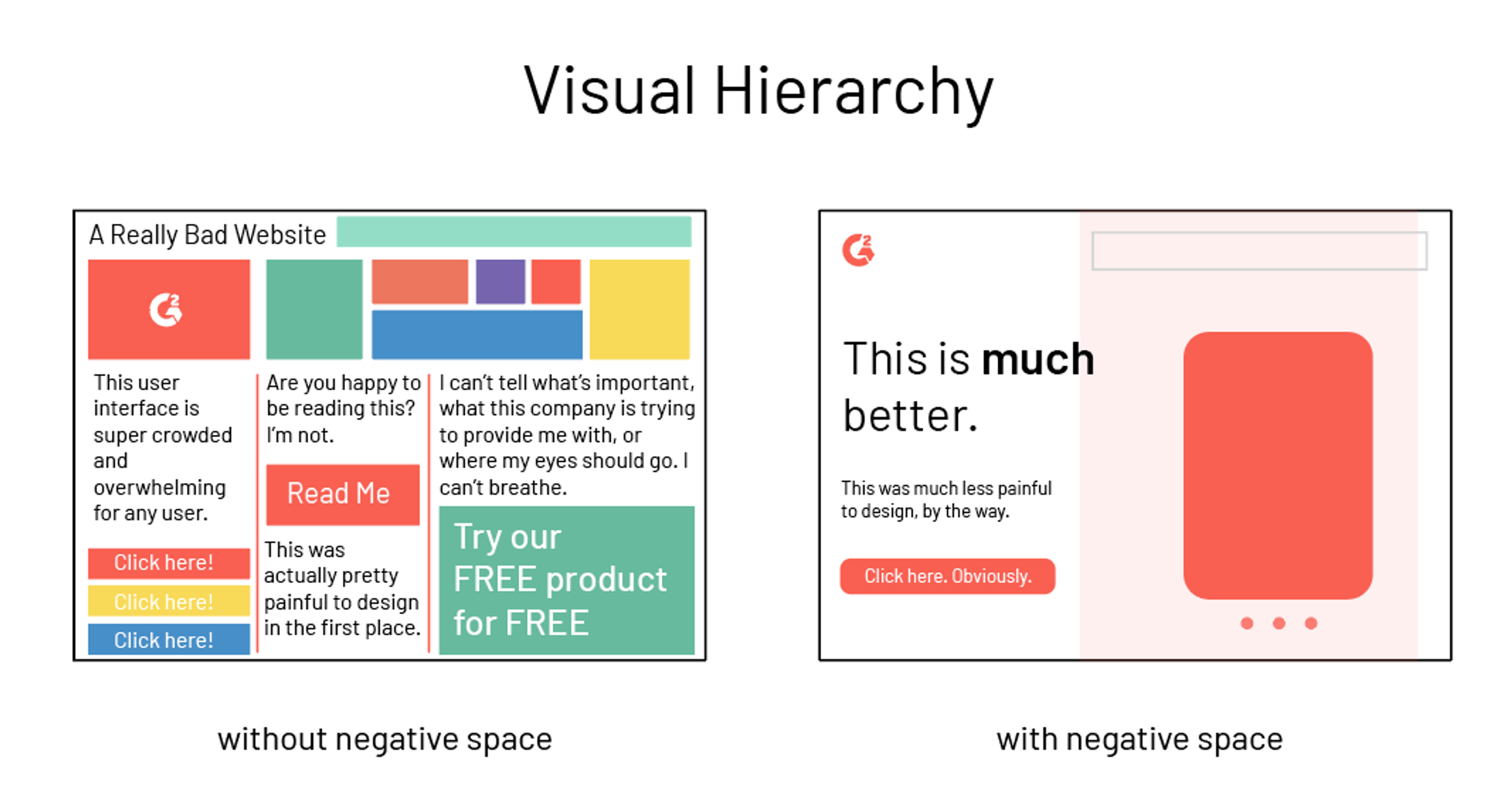
Visual hierarchy involves arranging and organizing page elements in a way that communicates their importance to users. Here are some tips to help you create an effective visual hierarchy on your website:
1. Imply importance using size and color:
Larger and more colorful elements are naturally more eye-catching and imply greater importance. Use size and color strategically to emphasize important elements such as headlines, calls to action, and key content.
2. When determining how facets of your site should rank in visual hierarchy, reflect on your business objective:
Consider the most important actions you want your users to take and the content that will help them make those decisions. Use this information to prioritize the visual hierarchy of page elements and guide users toward the most important content and actions on your eCommerce website.
3. Apply visual hierarchy to every page:
Consistency is key when it comes to visual hierarchy. Apply the same principles of size and color to every page on your eCommerce website to ensure a seamless user experience. This will help users understand the importance of each element and navigate your site more effectively.
FAQs on Websites
As an eCommerce website owner, you may have wondered how to present frequently asked questions (FAQs) in a way that effectively serves your users. Here are a couple of things to keep in mind when creating your FAQs page:
1. Avoid FAQs that are sales copy in disguise:
Users expect to find relevant and honest answers to their questions, not just thinly veiled sales pitches. Make sure your FAQs provide real value and don't come across as an attempt to push your products or services.
2. FAQs are more effective in context than on a separate page:
Instead of creating a separate page for your FAQs, consider integrating them throughout your eCommerce website where relevant. This can help users find answers more easily and keep them engaged with your content. For example, you can include an FAQ section on the product pages, checkout process, or support pages of your online store.
Visual Design
Visual aesthetics play a vital role in creating a positive user experience. And positive user experience tends to translate into more money for your eCommerce business. Here are a few tips to help you improve your site's visual design:
1. Use large, inspiring, high-quality photos:
High-quality images can grab a user's attention and help them connect with your site's message. Use photos that are relevant to your brand and content.
2. Go for simple and prototypical designs:
Users respond well to designs that are familiar and easy to use. Stick to simple layouts and use standard design conventions for buttons, menus, and other elements. This will help users navigate your eCommerce site more easily and find the information they need quickly.
Internal Search
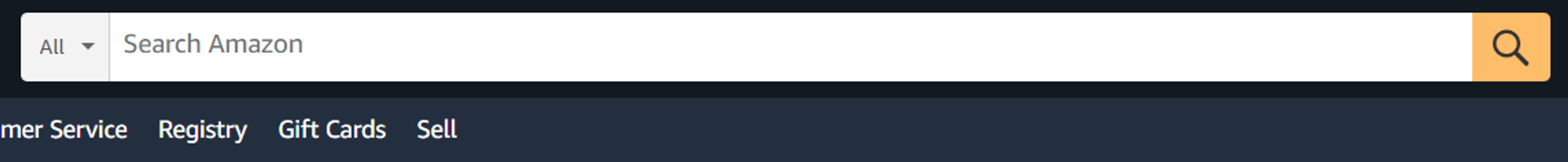
Good site search functionality is a common feature of great eCommerce websites. Making sure your search box is effective and user-friendly is crucial for driving conversions. Here are some tips to improve your internal search experience:
1. The search box should be big, noticeable, and placed in a typical location:
The search box should be easy to find and use, so make sure it's prominently placed on your website and has a size that makes it easy to type in. Consider putting it in a visible location, such as the top right or left corner of your site. This way, users can easily find the search box and use it to find what they're looking for.
2. Design product images to appear in the search box:
Having product images in the search box can make the search process more engaging and visually appealing for users. Consider using product images in your search box to showcase your products and improve the overall user experience.
3. Search should be able to solve typos:
Users often make typing errors while searching for products. Hence, the internal search system should be able to correct these mistakes and redirect the user to the relevant page. This can save time and prevent frustration for the user.
4. Avoid "no results" type pages:
When users search for a product that does not exist, it is essential to avoid displaying a blank page with a message saying "No Results Found." Instead, provide suggestions for alternative products or show related products from your online store to keep users engaged.
5. Offer auto-complete:
As users start typing in the search bar, auto-complete suggestions can help them find the right products faster. These suggestions can also be based on the user's search history or the most popular products on the eCommerce store, making the search experience more personalized and efficient.
Shopping cart pages

The shopping cart page is a critical step in the conversion process. Therefore, it's important to optimize this page to maximize sales. Here are some tips to help you do just that:
1. Test different add to cart notifications/designs:
It's essential to test different add-to-cart notifications and designs to determine what works best for your eCommerce store and audience. Some options to consider include pop-up windows, slide-in notifications, or a change in the cart icon. These options can help draw attention to the add-to-cart button and provide a more engaging shopping experience.
2. Focus on clarity and control:
Shoppers should know exactly what’s in their cart and how they can edit their purchases. Provide clear and concise information about the items in the cart, including price, quantity, and any applicable discounts. Also, make it easy for shoppers to edit their cart, including the ability to remove items, change quantities, and apply coupons.
3. The “checkout” button should be at the top of the visual hierarchy on the cart page:
Make sure the "checkout" button is prominently displayed and easy to find. This can be achieved through visual design, such as size, color, and placement.
4. Offer a few alternative payment methods, like PayPal and Amazon:
Providing multiple payment options can help increase conversions and make the checkout process smoother for users.
5. Remind shoppers of your purchase-related perks like free shipping, trust badges, and/or returns:
Including information about perks such as free shipping or easy returns can help encourage users to complete their purchases.
6. Don’t show off the coupon code field:
If you have a coupon code field on your shopping cart page, consider hiding it until the user clicks on a specific link. This can help prevent users from abandoning their cart to search for coupon codes elsewhere.
Ecommerce Checkout Pages
When it comes to designing checkout pages while building an e-commerce website, there are a few key things to keep in mind:
1. Entering credit card information should be the last step of the checkout process:
Customers are often hesitant to enter their credit card information on a website they are not familiar with. By making credit card information the last step of the checkout process, you can build trust with your customers and increase the likelihood that they will complete the purchase.
2. Use trust badges and other security features:
In addition to making credit card entry the last step of the checkout process, it's also important to use trust badges and other security features to make customers feel secure when dealing with your online business.
Trust badges such as Norton Secured or McAfee Secure can go a long way in reassuring customers that their information is safe. Additionally, SSL certificates and secure payment gateways can further enhance security and build trust with your customers.
3. Show off your security features:
SSL, encryption, etc. One of the key concerns for customers during online checkout is the security of their payment information. To instill confidence, showcase the security features of your website, such as SSL encryption, secure payment gateway, and other security measures.
4. Store credit card information in your system:
Offering customers the option to store their credit card information in your system is a great way to streamline the checkout process. This makes it easier for them to make repeat purchases. However, you should also ensure that the data is kept secure and comply with all data protection regulations.
5. Design the payment form to look like an actual credit card:
To make the checkout process more user-friendly, it's a good idea to design the payment form to look like an actual credit card. This will make it easier for customers to input their information correctly and reduce the likelihood of errors.
Additionally, this will also help to establish trust with customers and make them feel more comfortable making a purchase on your website.
Summary
With this, you should now know everything you need to create a great eCommerce website and start raking in profits.
However, an amazing website alone is rarely enough to achieve success. You also need great marketing. Schedule a free audit and learn how we can help your business become a leading eCommerce platform.