Email Marketing: How to Create Landing Pages that Collect Email Addresses
Posted on 10/18/2023
Reviewed by Arnt Eriksen updated at 11/6/2023
Introduction
To start running email marketing campaigns, you need leads. To get these leads, you need to design great landing pages that can capture them.
In this article, we will tell you how to do that.
What is a Landing Page?
A landing page is a webpage that intends to persuade website visitors to carry out a particular action that amounts to conversion. This could be buying a product on your online store, installing an app, filling out a survey, or signing up for an event.
Landing pages typically come with content that intends to convince the consumer to convert, such as testimonials, lead magnets, discount offers, and many more.
What is Email Capture Landing Page?
An email capture landing page, sometimes also referred to as an email sign up landing page, is distinguished by its goal. While other landing pages convert when visitors make a purchase, install an app, or carry out some other activity, this is a landing page to collect emails.
You might think " Why would I put in the effort to create a landing page just to collect email addresses?"
Here's the thing - email marketing is the most cost-effective tool to acquire new customers. Once you captured an email address it stays with you forever so you don't have to pay platforms like Google or Meta to reach your previous website visitors.
This gives you the chance to not only convert on the product you are currently marketing but to also convert on subsequent products that you will sell.
You can design a separate email capture page for each of the specific audiences you want to target. This allows you to segment your customers based on their importance, conversion rates, or other factors.
Tips for Creating Email Landing Pages That Convert
1. Know Your Audience and Their Problems
The first step to making excellent email landing pages is understanding your audience.
People want to be sure that you will be able to solve their problems.
Landing pages work when they reflect the mind of your audience. When you create a landing page that is designed for collecting emails, you have to create a buyer persona.
Where does your audience live? How old are they? What are their interests? What are their struggles?
These questions help you determine how best to communicate your offer to them in pursuit of your desired responses. This is why it is helpful to segment your audience and reach out based on the segments you have created.
You may also segment based on the information provided, such as geographical location, age, gender, occupation, interests, and income.
2. Focus on brand consistency
It is quite helpful to create both your email and your email landing page templates using a similar design. Let's look at it like parts of a house. While there are various rooms in it, there have got to be some things they all have in common. Whatever this factor is, it makes you feel that you're still in the same house.
In the same vein, moving from the email to the landing page should maintain the impression that the user is still within the same message. From the actual text of the email to the colors, fonts, and overall concept of the design, you need to make sure that they are in sync.
Besides, getting to a landing page that looks similar to the email assures your clients that the link has led them to the right page.
Now let's highlight Charity: Water's email as a great example here.
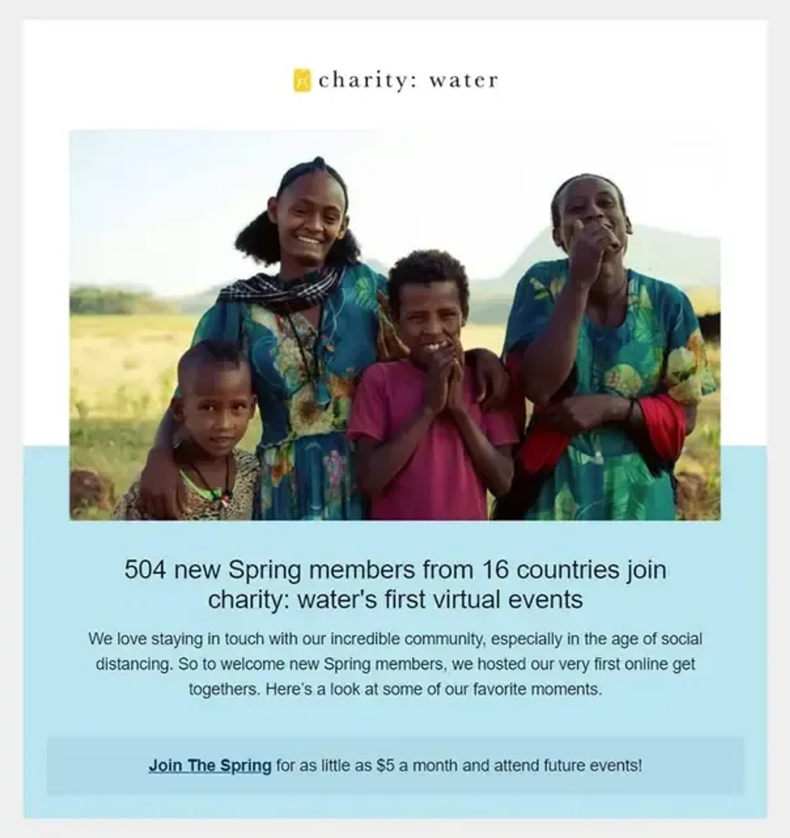
This mail has a simple blue design with a Sans serif font. After inviting readers to join the spring, it welcomes them to a landing page that retains the font and the color palette of the email.
This subtle confirmation that the landing page is a continuation of the mail gives the landing page visitors the confidence to proceed with the process.
3. Use A Compelling Headline
The headline of your landing page is the first thing the users read. Sometimes, it is the only thing they will read.
So if you want the visitors to convert, you better make your headline count.
For the eight in every ten users that go past your subject line, your headline becomes the second chance to make a first impression.
This is why your copy must be unique and compelling. As creative as you can get with your headline, make sure it doesn't stray from the original message of your landing page. It should also be clear and easy to understand. Do not make your visitors wonder if they've come to the right place.
It's also very helpful to split-test your headlines.
4. Keep it Short and Simple
audience, you have to resist the urge to draw up a questionnaire.
People who land on your page have most likely gotten there with an interest to solve their problem. You don't want to keep boring them with questions till that interest wanes.
As you design your landing page, write down the important questions and then eliminate them by order of importance. You can stop when you're left with three. It is advisable to keep the words below 500. Now let's look at an email landing page example from Charity: Water.

The landing page opens with brief information about the call to action in the mail: Join The Spring.
It proceeds to give options for donation. This saves the audience time to think and helps them decide more quickly. (It's that thing about getting them to convert while you still have their attention)
It also gives further information about the donation, however brief. Then there's another call to action, which is to donate monthly.
Pressing the button sends the audience to another stage of information sharing. The landing page collects information in such a gradual way that the audience records progress while their attention and interest are retained.
Like Charity Water, chances are that you'll get to ask your audience more questions if you play your cards right. In the meantime, stick to the purpose of the landing page.
While at it, you want to use simple words and expressions to keep the message compelling. Imagine yourself in your audience's shoes as you design the landing page.
You can draw inspiration from the simple words and uncluttered design by Charity Water. Not to mention that it also maintains the blue color palette like the email, keeping both in line.
5. Don't Mess with your Call to Action
A punchline for your headline, a short copy that conveys the message, and a killer call to action - that's how it's done.
Identify your primary CTA and stick with it. It's not ok to give multiple different calls to action on one landing page.
Directing users on a detour through navigational links tends to reduce your rate of conversion, and here's why.
For every link that leads to an FAQ, or some blog post you wrote 3 months ago, you lead your audience away from your primary call to action.
This is why you have to focus on your primary CTA, weeding out as many distractions as possible.
If there was only one CTA button in your entire mail, then your primary landing page CTA should continue it. Make sure to convey clear instructions using strong words that compel.
If you're offering a lead magnet, embed it in your call to action. Typically, this would look like "Get your free diet plan now!"
6. Use Visual Content

The human mind processes images about 60,000 times faster than text. No wonder 80% of people are more likely to read content that has an adequate sprinkle of colorful images and texts.
Bringing that to your landing page, you can add images and videos to your design to keep your audience engaged through the process as they fill the page.
Not only is your audience more likely to engage. They are also 80% more likely to convert. Sweet stuff huh?
You can usher in short explainer videos that pass the message clearly and succinctly.
While this is a certain upgrade option, you have to make sure the files you upload have no loading or display issues. We don't want the media material acting up with a first-time visitor. You don't always get a second chance to make the first impression.
Consider using relevant images of your target audience.
8. Test Your Landing Pages
Landing pages record an average of 2.5% rate of conversion. It is possible to aim higher, but for that, you'll need to do A/B testing.
Evaluate your landing pages by testing them with consistent strategies using A/B testing. Chances are, the email marketing platform you are using already has tools for that - you'll just need to use them.
Email Capture Landing Pages: Examples That Work
This segment gives email landing page examples that have implemented the tips above.
First, let's take a look at Templatery:
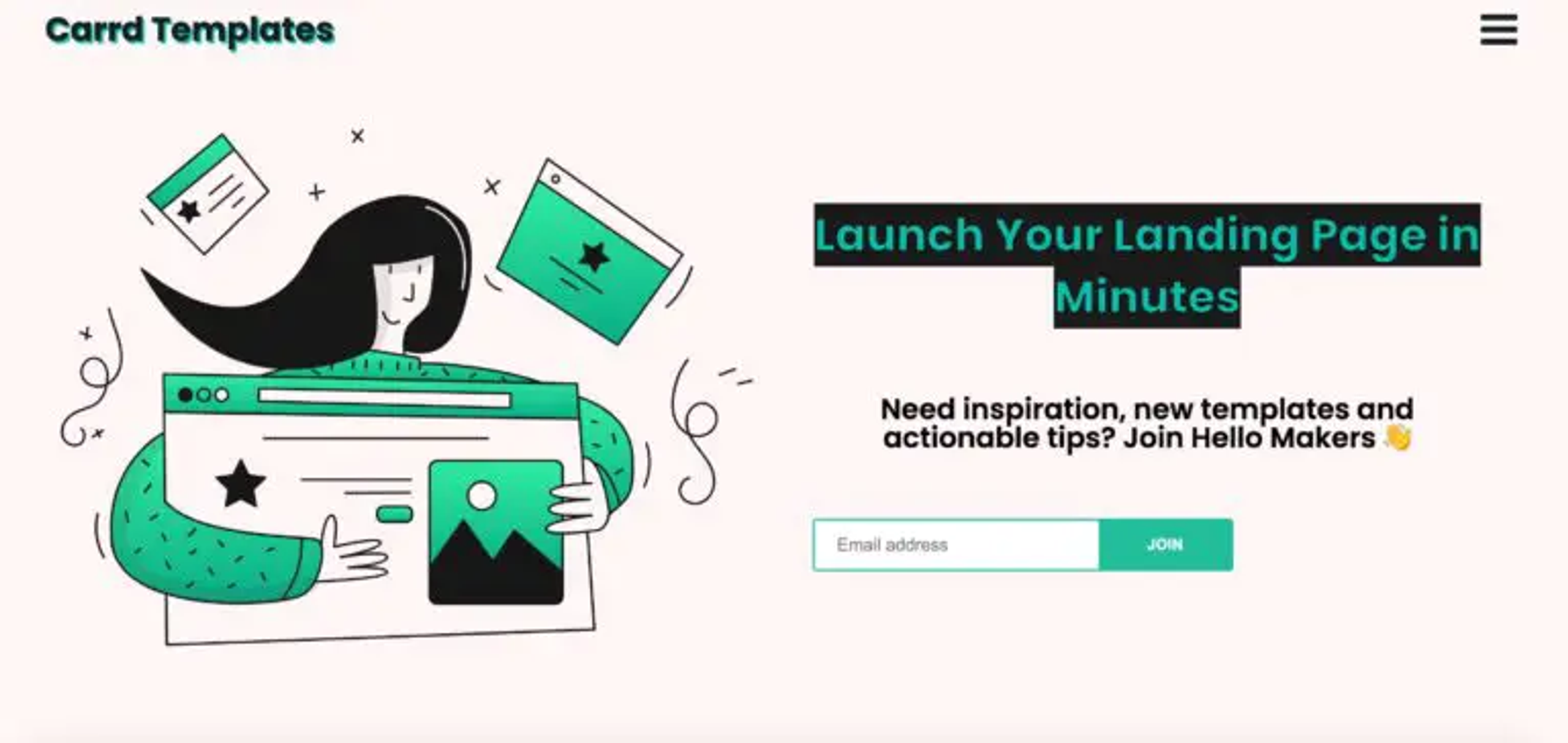
The design of their email signup landing page is simple and easy on the eyes, with soft shades of green. Their headline clearly states the value you have to gain from signing up. It also specifies the amount of time a user would have to spend.
However, "in minutes" might give people the wrong expectations. You don't launch a landing page that fast if you care about its content and effectiveness.
In terms of required fields, this is a perfect landing page for email sign up. It only asks for an email address. Users don't have to commit time to type their names and phone numbers. This makes them much more likely to sign up.
Next in line is Kabbage:
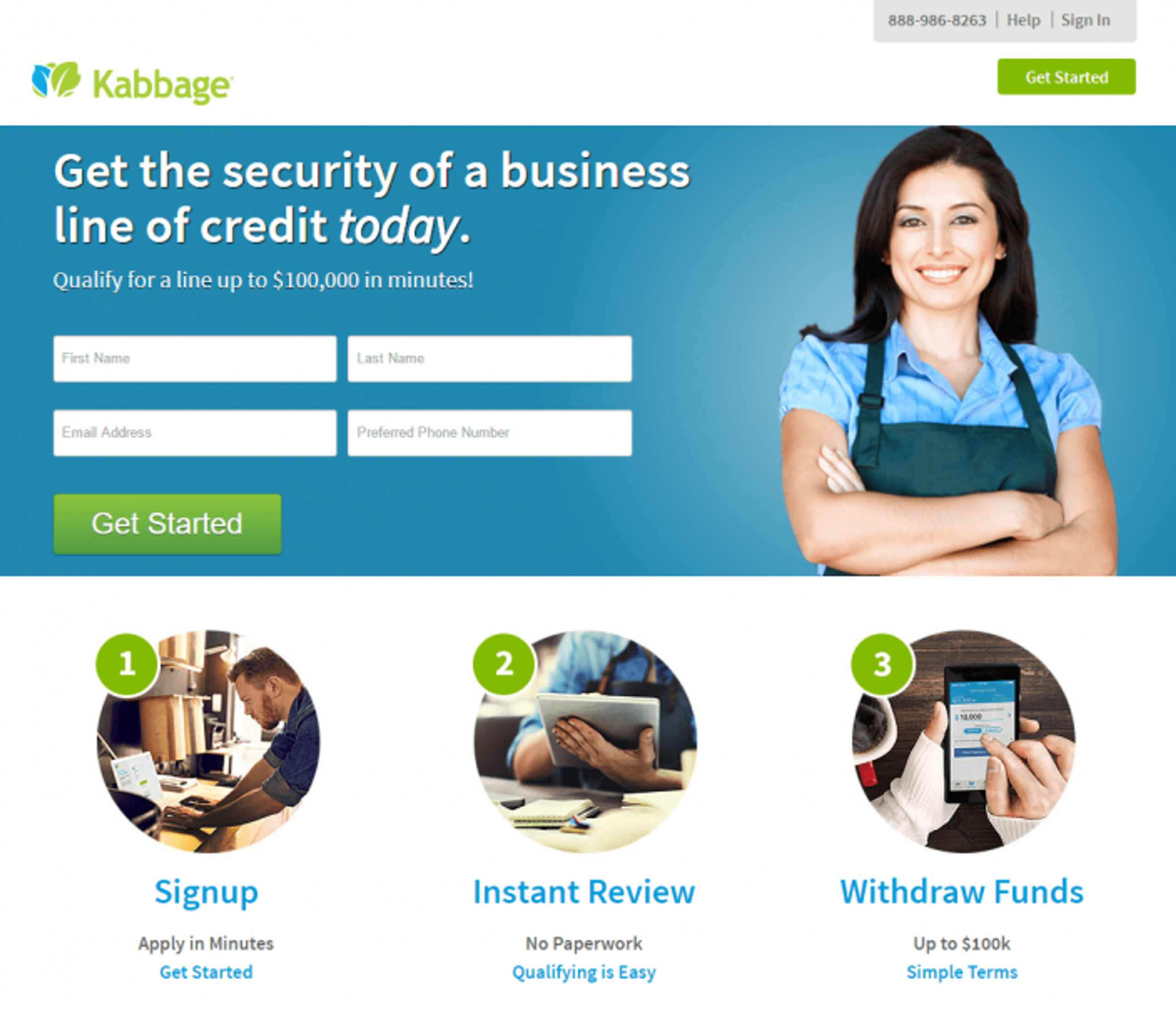
This lead capture landing page by Kabbage welcomes you with a colorful design with words fitting nicely around the pictures that draw you in.
Nevertheless, there's so much going on that you would need to read the text to get the story. In other words, every part of the landing page works together.
The headline also offers value that gets you interested. The highlighted confidence of "Today" makes it even more difficult to ignore. This makes for a compelling headline.
The subheadline gets even more specific with the offer, offering clear benefits that you can gain from the product.
It plays with the dangerous multiple-link rule, but the smart move here is that every link converts the audience at various stages of the funnel.
Summary
In conclusion, your landing page is the bridge between an excellent marketing email and your conversion rate. The better you are at it, the better your overall ROI on email marketing will be.
If you want your email marketing to work at its full potential, consider taking a look at what we can do for you.
