A Guide to Facebook Ad Creatives
Posted on 11/1/2023
Reviewed by Arnt Eriksen updated at 11/15/2023
Introduction
When it comes to online marketing, you can not compromise on the quality of your Facebook Ad creatives. Psychology, statistics, and neurobiology prove that visual content is integral to the success of an online campaign. Rochester University concluded from its study that people use 50% of their brains to process visual information.
If people use that much brain power to process visual information, then it only makes sense that your Facebook marketing goes side by side with matching the best practices for quality creatives.
What is a Facebook Ad Creative
A Facebook ad creative is a visual material that contains advertisement details and may serve various campaign objectives.
In simpler terms, it's called an Ad. It remains an essential part of the Facebook campaign structure as seen in the image below.
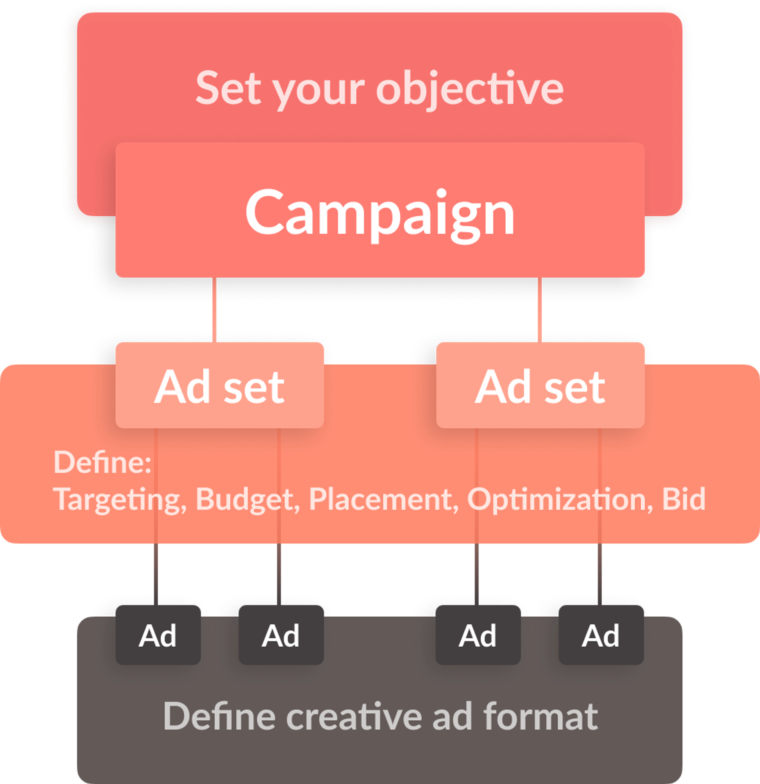
So Facebook ad campaign, Facebook ad, Facebook creative. What's it all about?
Your ad campaign is quite similar to a file cabinet. In that file cabinet, you find folders. In the Facebook context, they are called ad sets. Then each folder or ad set contains several files known as ad creatives.
Let's analyze two ad creatives from the same ad set.
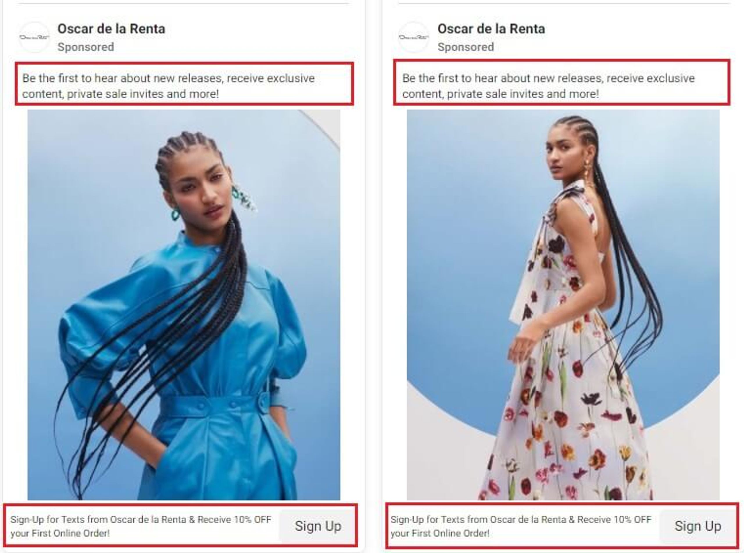
These two examples of a Facebook Ad copy are basically the same thing - different variations of a single thing. They come with identical ad copy and call to action (CTA).
So if it's all duplicated, what's the stress for?
When you use multiple ad creatives, you can use A/B testing to determine which piece of content is most effective in conveying your message. When you find that one, you can then implement strategies to scale the ad.
But before we get to creating an ad for your audience, you have to decide what ad type you'll need.
1. Video Ads
Video Ads market products using a video or a GIF. They are mostly used to tell stories pertaining to the product or event. They can also be used to demonstrate the product and how it works.
Video Ads remain one of the most effective ways to connect deeply with your audience.
It is on record that social media users view about 8 billion ads every 24 hours. The numbers are not the same for other forms of ad content. This is a general reflection of internet users' preference for video content.
More specifically, 54% of respondents from a survey indicated that they would prefer to see video ads from brands.
Another research showed that 84% of consumers were more driven to purchase a product after watching a video that the brand posted.
Seeing that the viewers love it, video ads have become a very popular choice among digital marketers. Even in Facebook's income records, only mobile-focused video ads account for about half of Facebook's income.
Video Ads come in six different ad formats when displayed on Facebook, and they are:
- In-stream videos
- Vertical videos
- Short Videos and GIFs
- Instagram Stories
- Video Collections
- Video Carousels
Now let's take a look at the best Facebook ad examples under video ads and find out what makes them so magical.

Facebook video ad by Kay Jewelers
The most unique part of this GIF ad is that it tells a story within seconds. And this strategy seems to be the norm with Kay jewelers. This Kay Jewelers ad earns another point for passing such a clear message even without the sound.
When you're modeling a product whose value is either sentimental or perceived as luxury, the best ad creative is the one that ties the products to emotions and moments.
Two necessary elements of such creative ads are a happy ending and a clear message.
Since Facebook ads do not give much time to pass the message, you have to avoid long stories and complex ideas. Always go for something short and sweet enough to linger in the minds of viewers.
Scoreboard:
Visuals:
You know how 1 picture says more than a thousand words?
This Ad ticks that box. From the onset, I get a general idea of what I'm about to watch, thanks to the initial screen capture.
Secondly, I get the drift of this ad even without the sound and that's important. Just so you know, 85% of videos that are posted on Facebook have no sound. But not all of those videos pass a clear message to their viewers.
Relevance
This ad pops up just after a tour of jewelry websites, especially in the search for necklaces that look like the one which appeared in the ad. The ad comes as a suggestion that is relevant because I had interacted with the product being advertised.
Value
Your ad should not only tell your customers to purchase your product but why they should purchase it. Kay tells us the importance or value attached to the necklace by showing us how happy the lady was to have received the necklace. There's also another cheat code to drive your emotions, the dog.
Call to action
Kay doesn't show you a happy couple and features a cute dog just for the fun of it. It ends the ad creative with a definite call to action. The main objective of this ad is to drive likes to the page. Seeing how impressed I am by this ad, I would gladly click my way to the other side of relevant content. And don't get it wrong, it's not just a me-thing. There are hundreds of customers who would fall in line with this ad, and I doubt you'd be an exception.
Facebook video ad by Allbirds
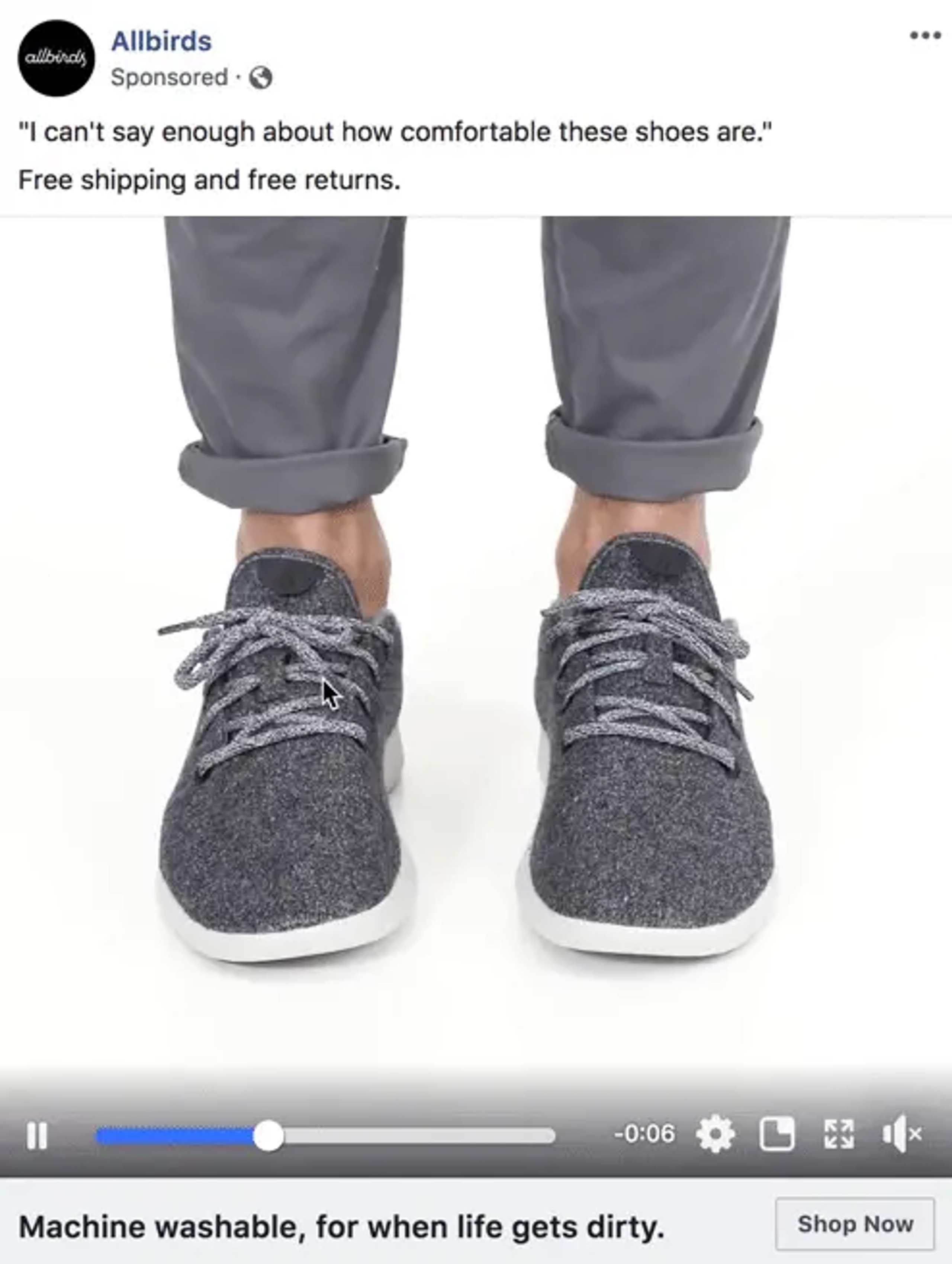
The two major things that catch my attention in this creative are the simplicity and functionality. First, it has a white background so your focus remains on the subject matter: the shoes. The video has a duration of nine seconds which it uses well. It shows you how the product works by demonstrating it in a laid-back and relatable way.
The major value the product offers is comfort. Not only does the ad communicate this through the copy, but also through the features in the video. A man wiggles his feet in these shoes with his pants rolled up to the ankle. This gives you the impression that the shoes allow you to let your hair down and get away with it.
The ad text adds another value, which also adds up to taking stress off you. There's no better way to drive a message home without trying too hard.
With millions of Ads aimed at impressing customers, you can choose to stand out with subtlety and simplicity. Your video ad could just be the breath of fresh air that catches attention after a burst of colors, objects, and motions.
Scoreboard:
Visuals: if watching this ad, you caught your eyes moving in alignment with the man's wiggling feet, then it's because the child in you was quite fascinated by what these random feet were up to. You were probably so fixed on the video that you didn't notice the copy beneath it until the video was done playing. That's the power of good visuals, they tend to draw you in.
Relevance: This ad popped up on the device of a shoe fan. Having followed shoe brands and watched shoe ads at least once per week, it makes "Retargeting" sense that such a viewer had this ad pop up on their feed.
Value
Whether you watch the video first, or you read the opening copy first, you will be hooked anyway. The opening copy catches your attention for three reasons. First, everyone likes comfort, so you want to see if it's the kind of comfort you'll need. Secondly, there are freebies there: shipping and returns. Thinking of the amount you get to save on shipping may encourage you to purchase the product, even before you know what it looks like. And third, there's curiosity. The ad copy hypes the product so you want to see how comfortable it is. If it's not so comfortable, you would probably roll your eyes and think "Yeah right"
Solid Call to action
At the bottom-right corner of the ad, the marketer tells you what exactly you are meant to do: "Shop Now"
Bolden's Video Ad: Tutorial
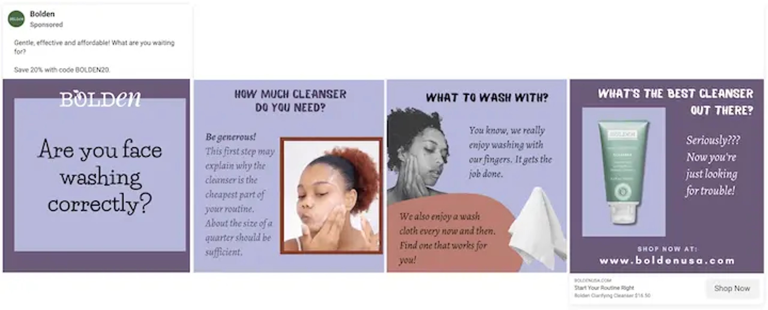
This video ad from Bolden stands out by offering value in the ad. It comes off as caring for your face enough to teach you how to wash it. Of course, you care about your face, and washing is not such a big deal so it's okay to spend a few seconds watching something as simple. It uses a harmless question to transition into the actual advertisement: "What's the best cleanser out there?"
Before you can decide, it answered the question on your behalf, pitching its cleanser as the best option. Chances are that you believe Bolden and here's why.
It puts your face before its products. This gives you the impression that Bolden seeks your best interest. Second, It teaches you a healthy way to go about a basic procedure. This positions Bolden as an expert whose conclusions come from a place of study, research, and verification. If I could summarise this logic in one word, I'd call it trust. This Facebook ad convinces the customer by building trust in a few seconds.
Scoreboard
This Bolden Facebook ad has some lessons that you should model your Facebook ad after.
You can add value by showing yourself as a trusted expert. This singular fact can account for customer retention and referrals.
The ad is optimized with words that directly address the viewer: If the Bolden ad had started with "How to wash your face correctly," it wouldn't catch your attention as much as something that caused you to pause and think. Now let's tweak the first statement into Bolden's statement.
"Are you washing your face correctly?"
When you read this, The first question that comes to mind is "Am I?"
Just as you ponder on that question, you realize that you can't give an answer if you cannot ascertain which procedure is best for washing your face. At this point, it becomes necessary for you to watch the video to find out whether you've been washing your face correctly.
Simply constructing the ad's copy properly was enough to incite doubt and curiosity.
You want to ensure that your word structure incites the expected reaction in the readers. Sometimes they are powerful enough to determine whether the viewer would watch your ad or skip it.
Come clean: when you run tutorial ads like this, the viewer can tell that you plan to advertise something. They actually expect you to advertise a product or event before the end of the video. But when you try to sneak your advertisement around two things are likely to occur.
First, the viewer neither gets the message nor the call to action because the advertisement wasn't clear.
Second, your advertisement comes off as shady and you lose the trust you were trying to build. If you want to advertise a product, do it boldly. The worst they can do is skip your ad and ignore your product. The irony is that this is less likely to happen given that they have interacted with your ad once, and Facebook could retarget them again.
2. Photo Ads
Photo Ads use a single static image. If you are advertising a conference, for instance, this ad format makes the venue or guest speakers the highlight of the ad. If you intend your ad to pop up in a Facebook news Feed, it is recommended that your image resolution is at least 1080 x 1080.
Image ads showcase your product in a simpler way compared to videos. However, this doesn't make them less effective.
Just like video ads, Photo ads work best when their images are of high quality and are used for the right campaign goals. A case study by Databox revealed that image ads could reach more people and generate more impressions than video ads in some instances. In a particular ad campaign, a Facebook image had a click-through rate that was 47% higher than video ads in that instance.
Image ads work best when your ad objective is to increase brand awareness among Facebook users.
Now we'll take a look at some image ads that stand out and why they make the list.
Dollar Shave Club Photo Ad
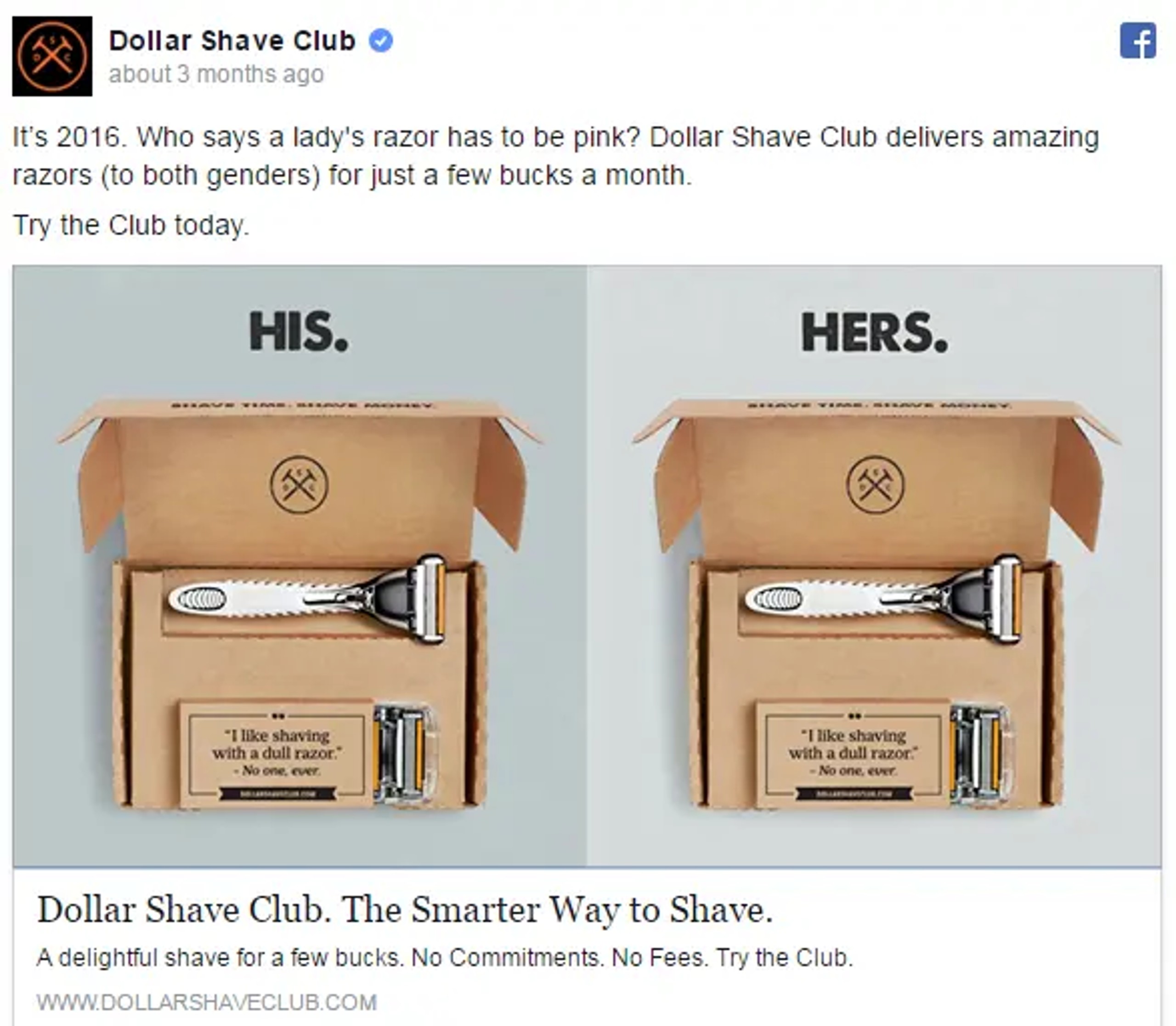
Inclusivity and gender equality are themes that echoed through the marketing trends in 2022. Now, they are as important as ever. So what do we call brands that have projected it in their brand awareness messages?
Future-forward.
Dollar Shave club happened to be one of those future-forward brands that challenged gender norms through a campaign. The result?
It opened its business to a new market.
Takeaways
Having brand inclusivity as one of your values is a good way to speak the language of society and echo the values of an evolving world. Messages like this give you an image of someone working towards the common good or lending your voice to a cause.
But it must translate into walking the talk. Are you targeting people that really care about gender equality? If not, they may not find your message compelling because they do not resonate with it. Is it also possible that you are narrowing out a potentially valuable audience by taking that stand? Is there a better way to word your message to reach more people?
Monday.com photo ad
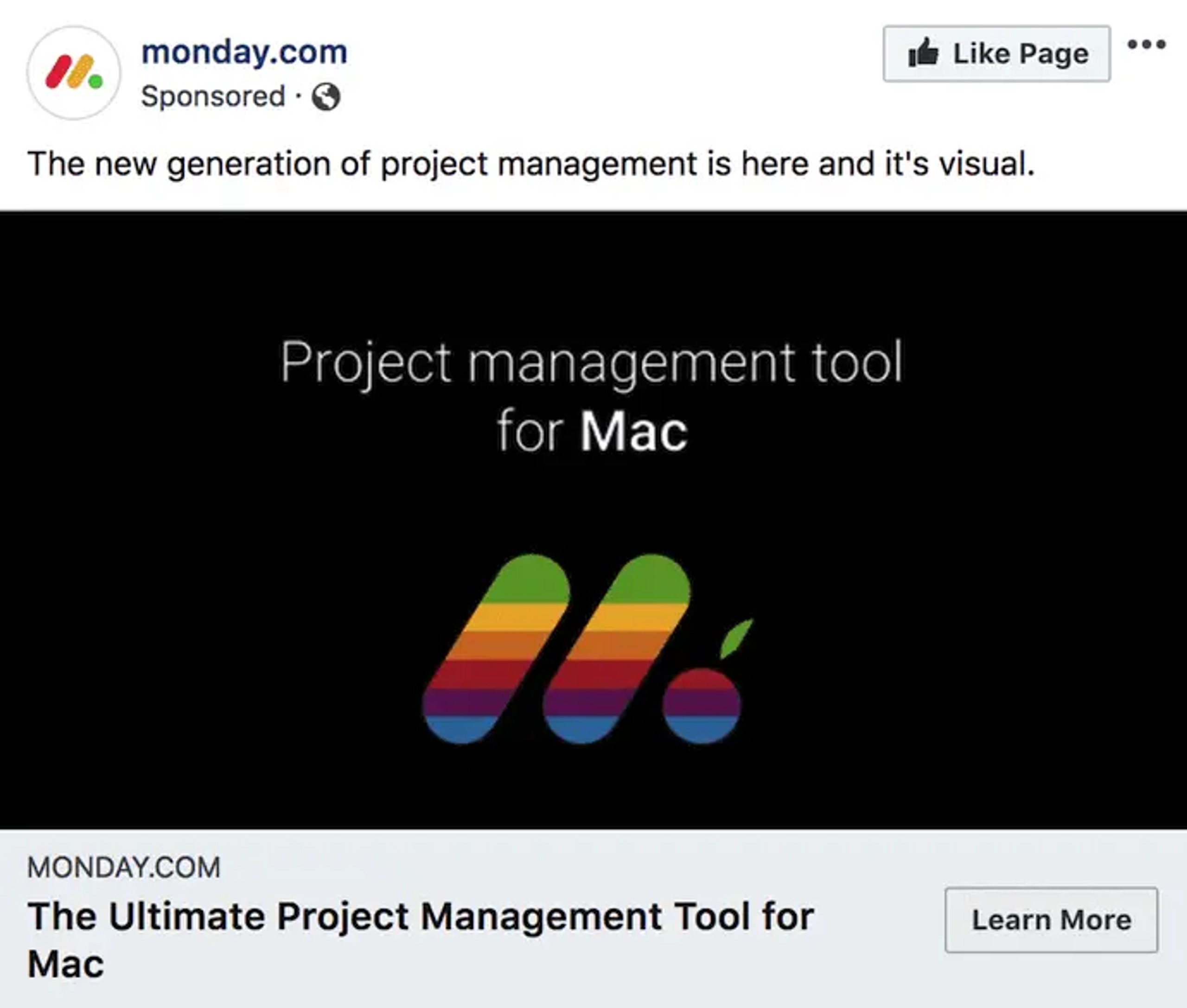
Monday.com is a tool for task management that caters to various operating systems, both desktop and mobile.
In the ad image above, Monday.com advertises its compatibility with Mac computers using symbols and colors. But there's more to this artistic expression. Monday.com remixes its logo with the original rainbow colors which the Apple brand is popular for. If you were a Mac user, you wouldn't miss those colors, and you would like to find out why a brand has similar colors as Mac and what they are about. That reaction can only be gotten when you pivot off the brand of a household name.
When Mac users turn aside to see why this brand looks like an Apple-inspired design, they get the message of the ad. At this point, Monday.com has increased its brand awareness in a unique way, planting a need for its product in the mind of the target audience.
Scoreboard
There's only one joker in this game, and that's the eye-catching coloring of the rainbow against an unfamiliar logo. For this ad to work, the customer must focus on the logo without distraction. The smart move here is the black background. With a background that is psychologically invisible, all there is to see is what Monday.com wants Mac users to see.
It's relevant: Not every ad can tick the box of relevance for such a large number of people. It also helps the users to realize a need and meet it with the advertiser's products.
It's valuable: The advertised product provides a better user experience for Mac users. As such, it offers value for Mac users who seek a more ordered structure.
It has a clear call to action: the call to action hints at the main objective of the ad, which is to create awareness. The "Learn More" at the bottom-right corner of the ad clearly invites the viewers to find out more about using this product on Apple hardware.
3. Stories Ads
Stories Ads are one of the most recent types of ads rolled out by Facebook using Facebook Stories. Facebook Stories allow you to post temporary clips and images for your friends to see.
This form of creative which is mostly used to share short moments can be seen on both desktop and mobile.
As viewers browse through their friends' stories, stories ads get shown to them randomly in between.
Because they could come off as distractions, it is always advisable that they have a natural format that makes them feel genuine and entertaining. They can be placed on Facebook, Messenger, and Instagram.
4. Messenger Ads
A Messenger Ad appears on the user's timeline as a direct message when they are online. This allows you to interact with your audience in real time, tell them about the offers you think they would be interested in, and listen to their responses. This would help you tailor subsequent messages to align with their interests.
Let's assume that your first message is "What product are you interested in?" The user has three responses to select from and the answer they pick leads your ad to offer them a more specific product as a direct message in the thread.
5. Carousel Ads
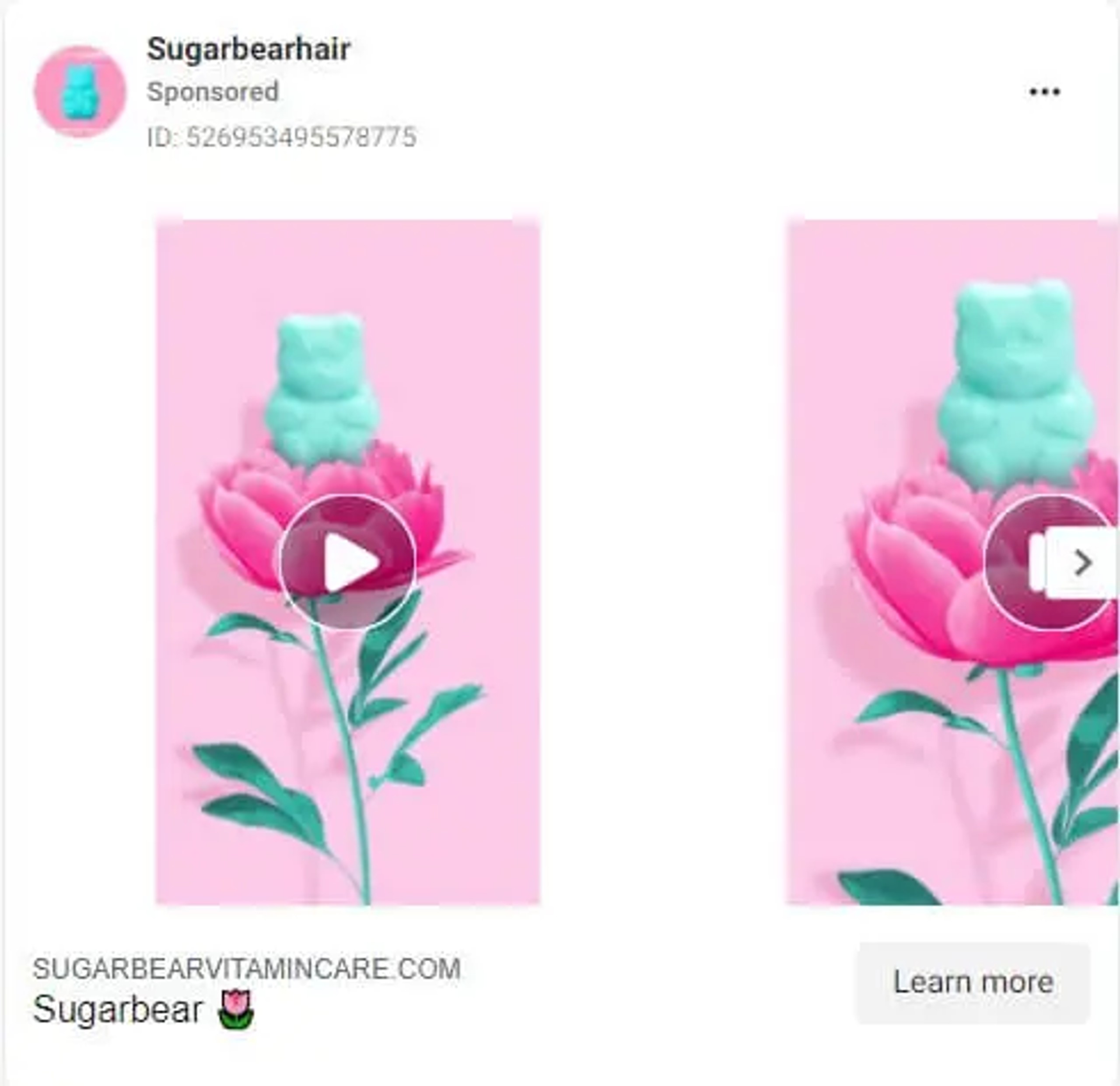
Carousel Ads are sets of still images, motion graphics, or videos that the users can look through to get information about a specific event or product which the ad is promoting.
Carousel ads can display up to ten images or videos at once. Each one will have a link to the relevant web page attached.
Since these ads allow you to share many Media materials at once, they are most suitable for:
- Promoting multiple features of the same product
- Explaining a process to potential customers
- Sharing a story or order of events that unfold through multiple videos or pictures
- Promoting multiple products
The carousel ad is quite effective for driving traffic to your website. Digiday asserts that a carousel ad is 10 times more effective in driving users to a landing page or website than a single image ad.
In addition, Facebook also revealed that carousel ads can help marketers significantly cut down their cost-per-conversion. It also reports that carousel ads have a cost-per-click that is generally lower by up to 20% compared to single-image ads.
So if you are looking to boost your website traffic, conversion rates, or App installs, carousel ads are a good option for you.
6. Slideshow Ad
Gather around if you thought slideshow ads are the same as carousel ads.
While they are not the same, they can look very similar.
Slideshow ads also let you show various elements within one ad but it is different in two ways.
First, slideshow ads can only play images in a slideshow. Another difference is that the ad automatically plays them in the form of a video, compared to carousel ads.
Slide show ads can be used to create an ad that gives the users a video ad experience while spending little time and money.
It is also suitable for advertisers who plan to choose from Facebook's library of ready-made images. This is one advantage that is unique to slideshow ads. This also helps customers simplify the concepts in the ad which could otherwise be complex.
Slideshow ads also help if you want to reach people who do not have a stable Internet connection. While slideshow ads look like video ads, they consume five times less data.
7. Collection Ad
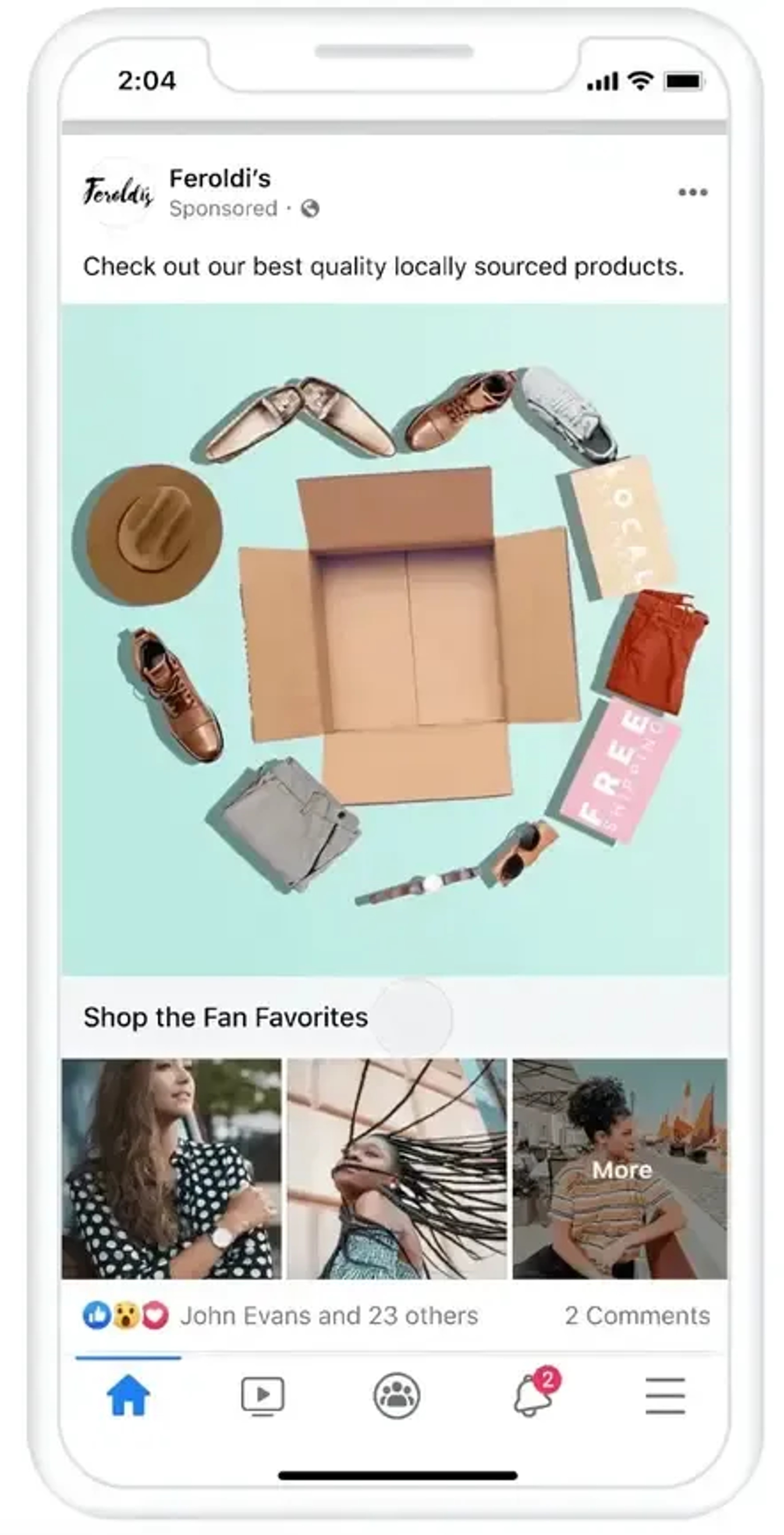
A Collection ad gives customers an in-store experience. So, when an ad shows customers a product they like, they can purchase it right there on Facebook. The ad is mostly made up of five images. A central image that shows the product you're about to buy, and four smaller images of the product.
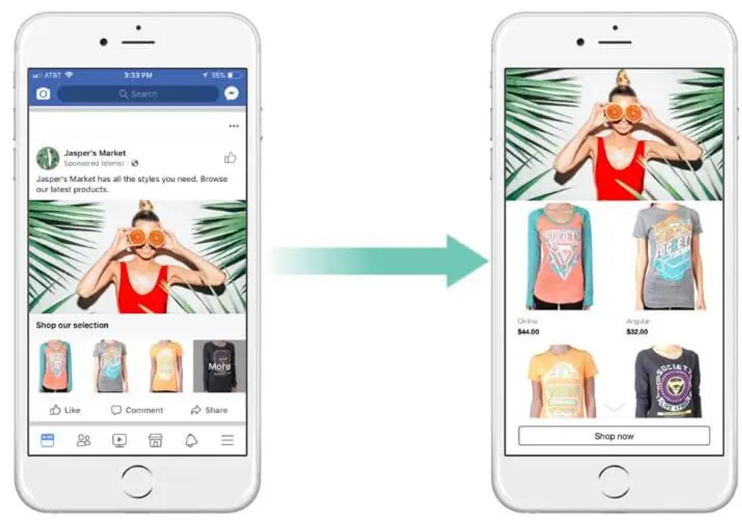
There are four types of collection ads. They are:
- Instant Storefront: This ad is suitable when you want to promote various products as part of one campaign and drive traffic to the product page of each product.
- Instant lookbook: If you are advertising a multipurpose product, you can use a collection ad to model the different purposes of the product.
- Instant Customer Acquisition: Collection ads drive instant traffic to your page, or prompt the viewer to take immediate action on the landing page.
- Instant Storytelling: This ad also works for telling the target audience a story about your brand or providing more information about your business.
8. Playables
This ad was designed with app developers in mind. When you are promoting your product, the ad allows your viewer to watch the ad, preview the app and play an abbreviated version of it, all within the ad.
3 Tips to Make the Most of Your Facebook Ads
1. Create Various Content to Make Up for Creative Fatigue
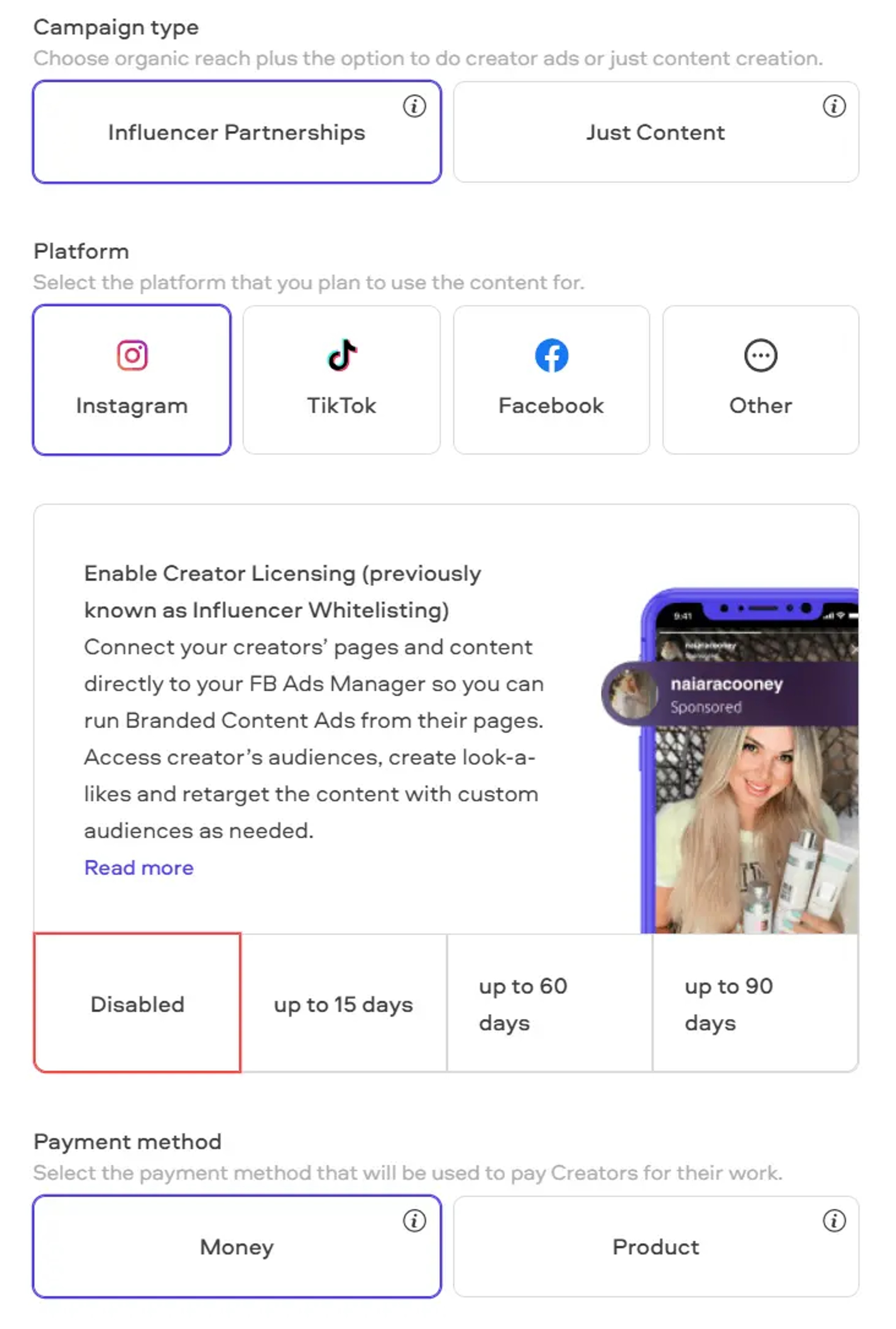
Your ad can be really magical at first sight. But remember that every time your target audience sees that ad, they lose some awe for it. If they keep seeing it, they get to the point where it becomes so familiar they no longer interact with it. When this happens, your potential customers begin to look past your ad because it's now one of the boring things. The way to keep your customers engaged is to enthrall them with new content.
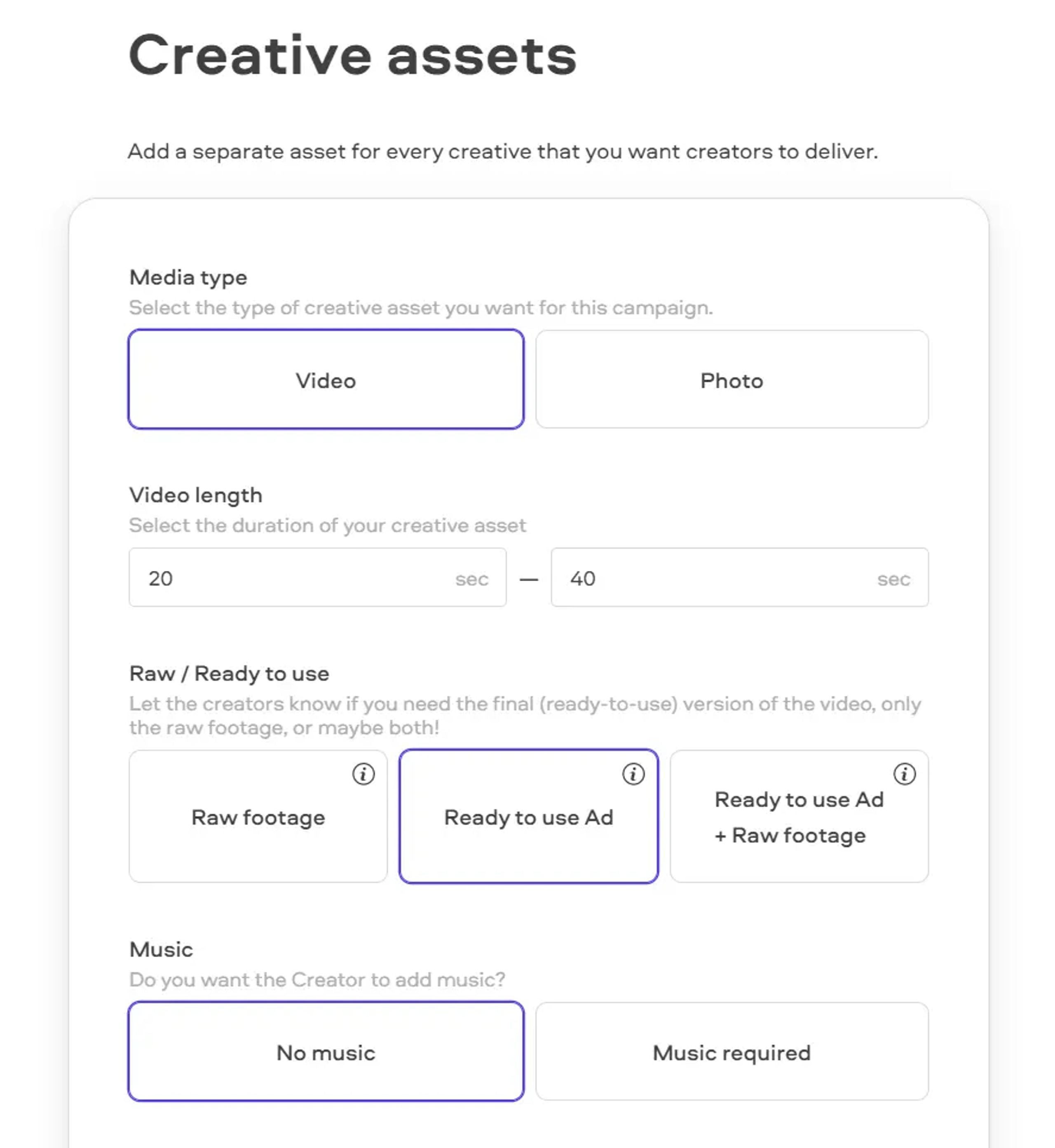
If your creative impulses are seasonal, you can make many ads at once and release them at reasonable intervals. You can also create a set first and design the next set based on your audience's reaction to the previous creative.
It's also advisable to run various ad formats at once so you can analyze each one and determine which works best for your brand and why.
2. Perform a Competitive Analysis Using Facebook Library.
Facebook makes ad creation easy. By using tools for finding content templates, you can draw inspiration from these templates to make something beautiful and compelling.
Prominent among these tools is the Facebook Ad Library. The Facebook Ad Library goes beyond giving you ad examples. It also helps with competitor analysis.
What are your competitors doing? What part of their strategies are working and why?
The Facebook Ads library reveals all of these details to you. To watch content in the Facebook Ad Library, follow the steps below:
- Select the country you want to see content from.
- Choose the ad category you want to explore.
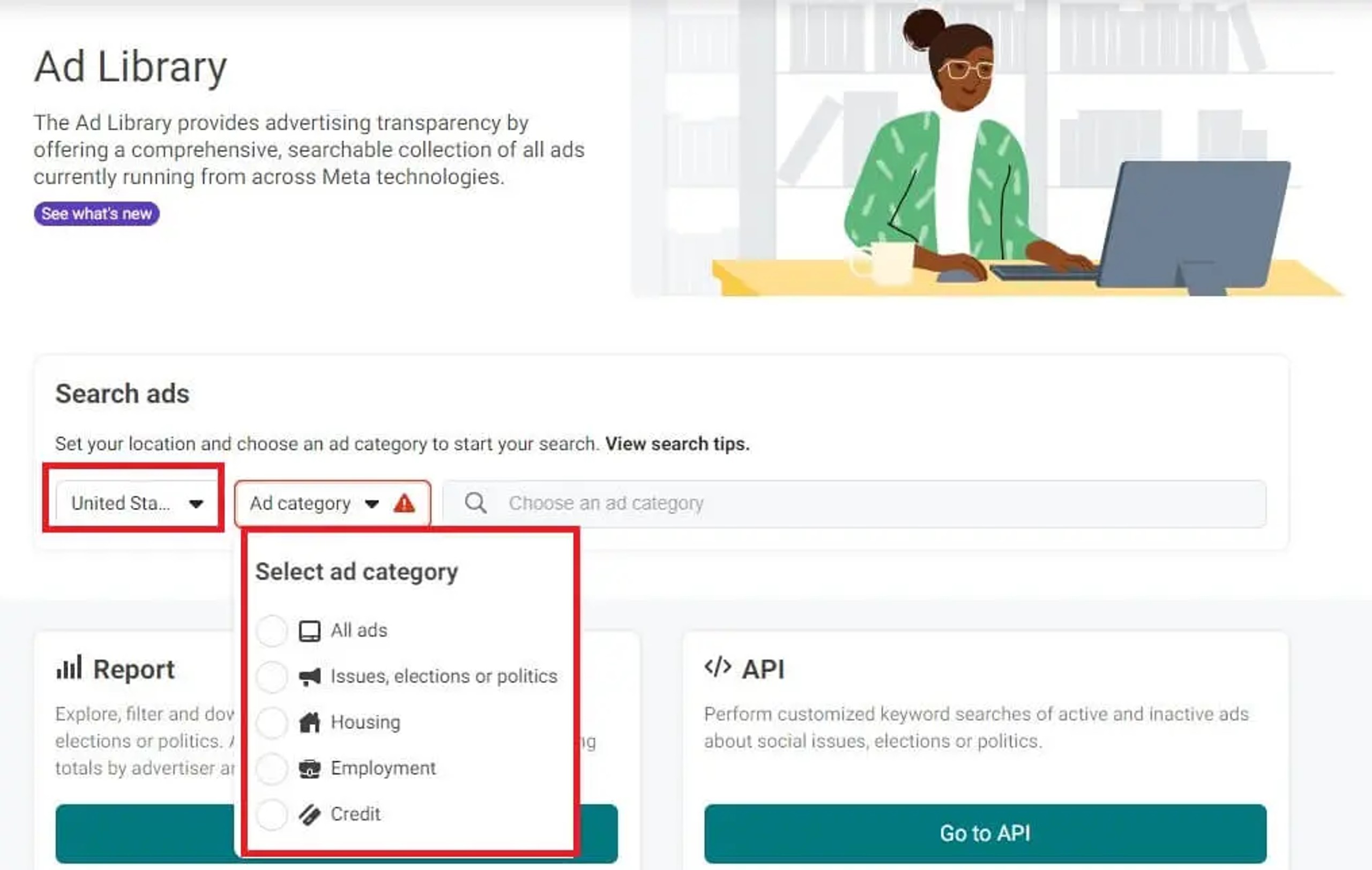
- Enter a keyword into the search bar
- Looks through the search results and pick the ad or competitor you would like to analyze.
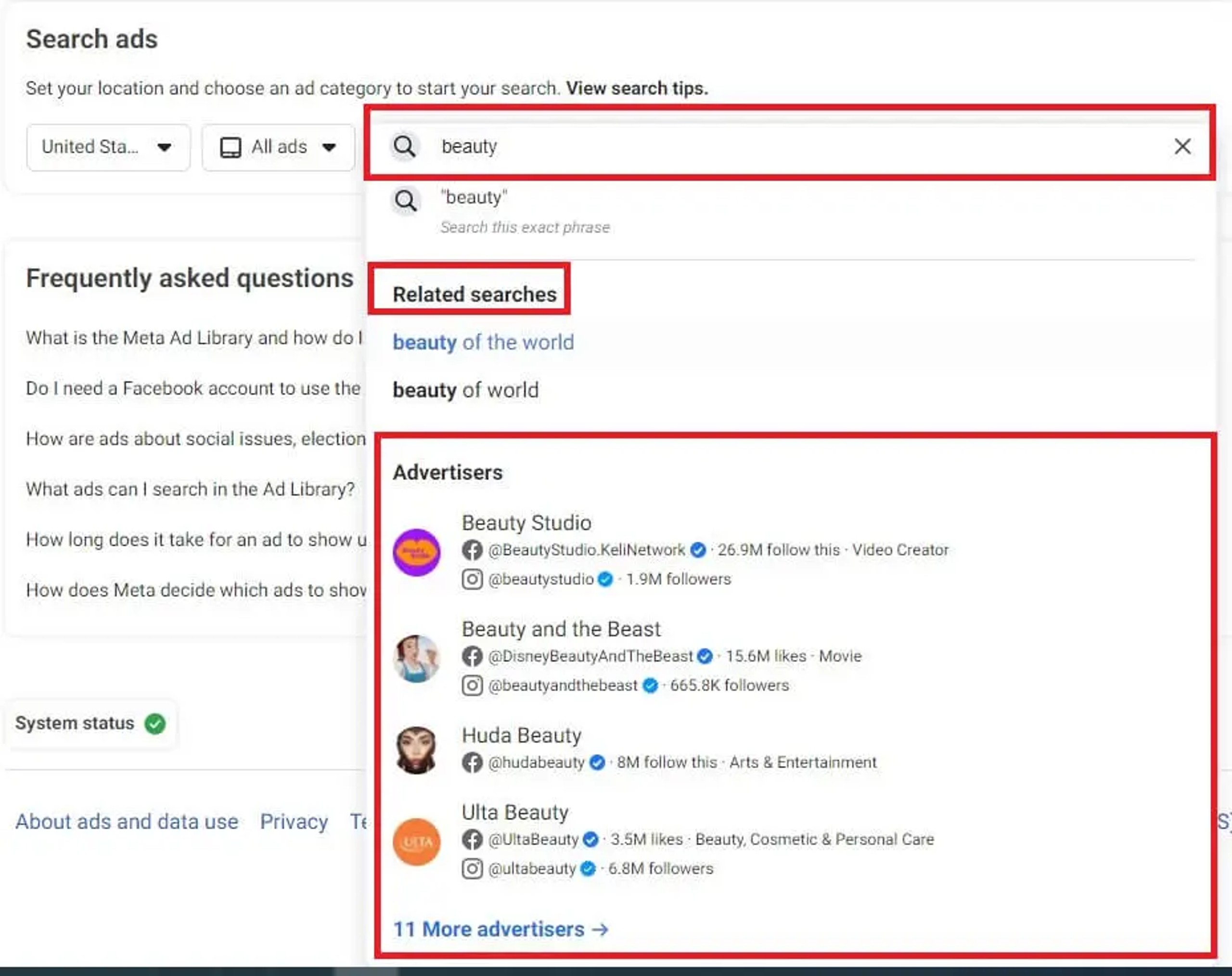
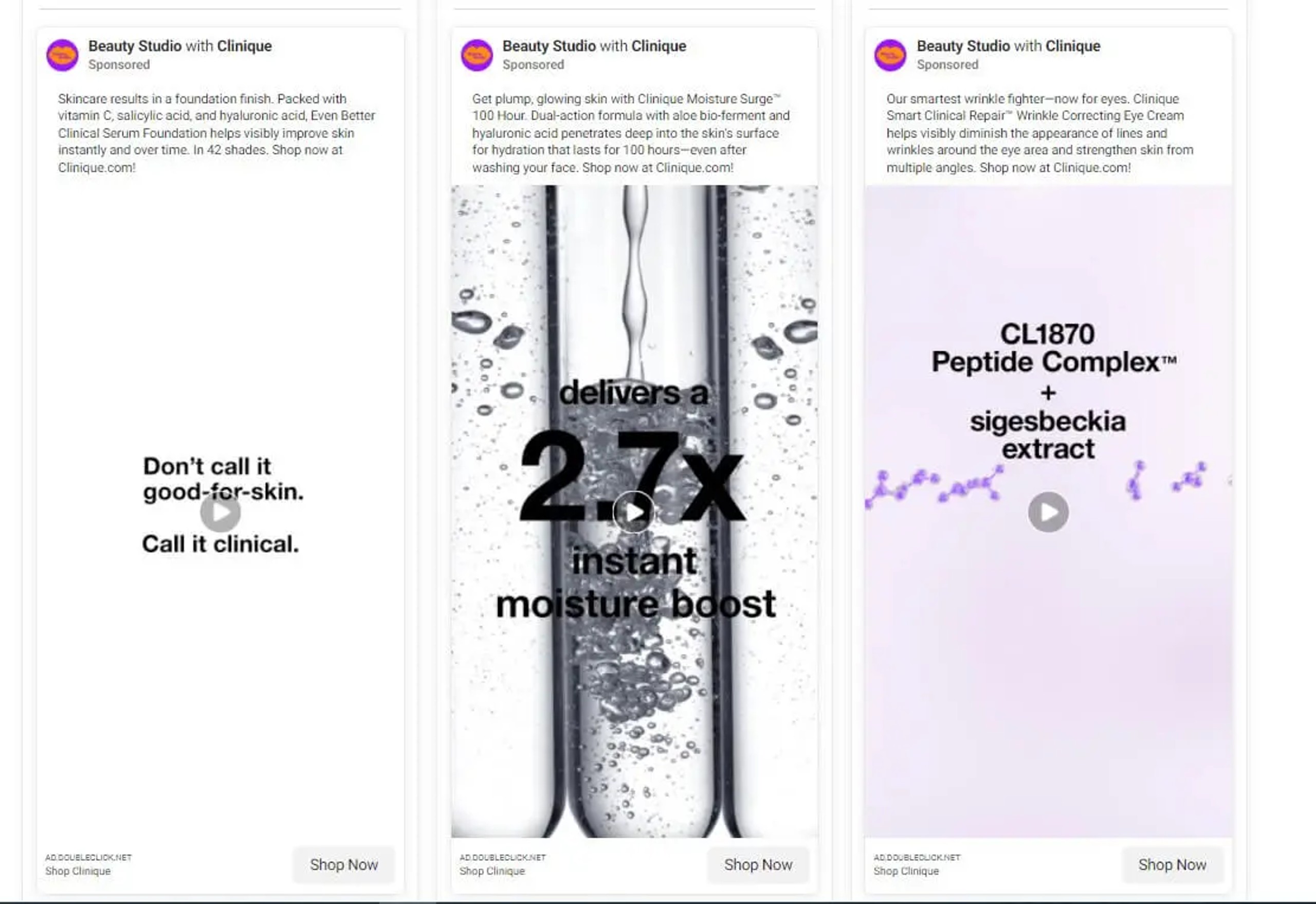
- Once you click on an advertiser, you will be directed to a page where you can see all the ads they are running at that moment, as well as the ads they had active in the past.
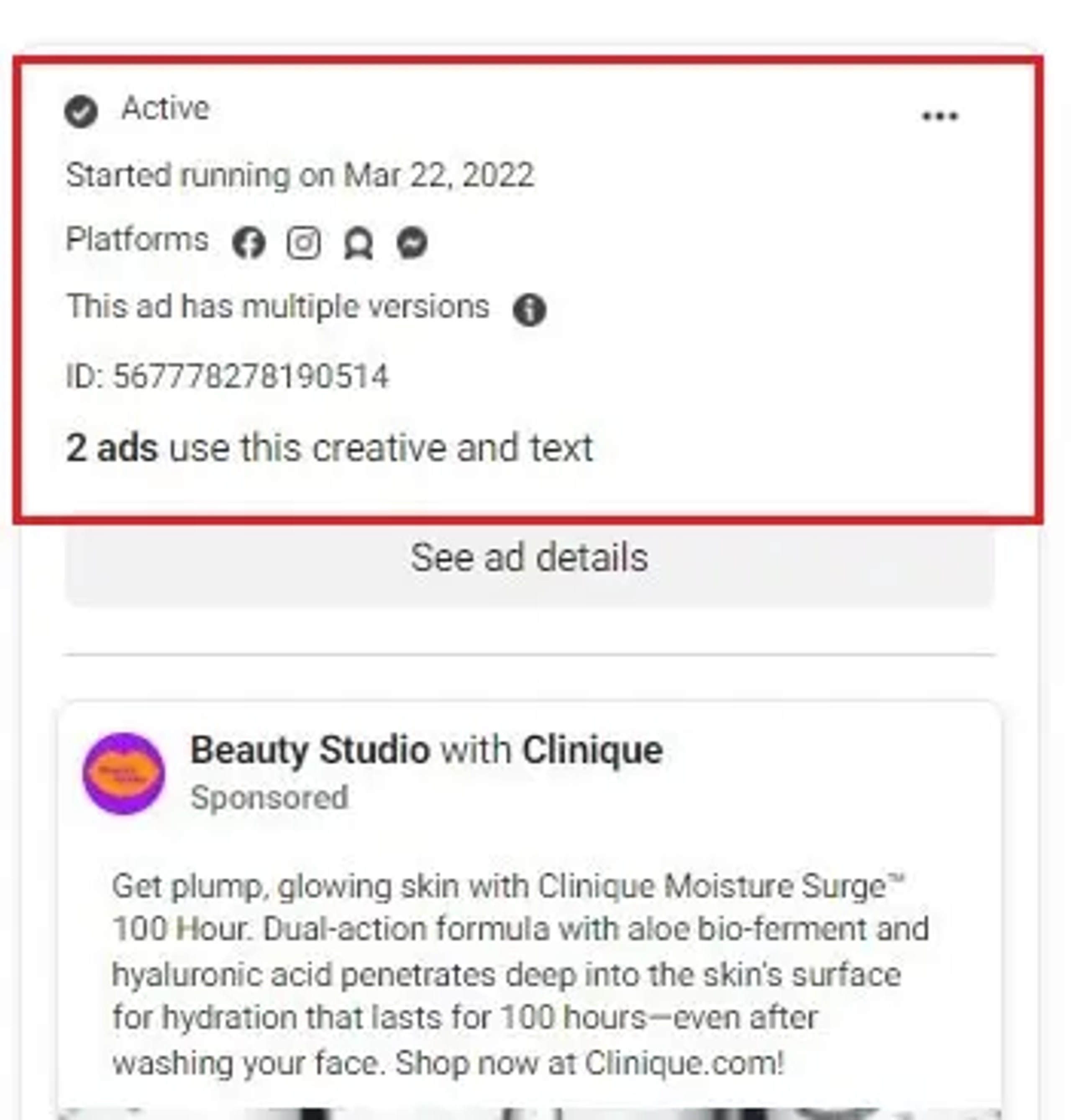
For each ad that you open, the algorithm can give you some details, such as:
- The date when the ad was launched;
- The current status of the ad: is it still running?;
- The platforms where the ad is posted on;
- If the ad has multiple versions.
3. Creative Quantitative Testing
When we were kids, we never put our kites in the air and walked away. The fun of flying kites was in watching how high they flew.
Launching an ad campaign goes beyond getting the ads out there. It's important to monitor the performance of the ad campaign so you'll know how best to scale or optimize the ad.
While you can wait long enough to get an analytics report, you can make a proactive move with quantitative creative testing. So what does this mean?
Creating various versions of the same ad to see which one works best. Tweak the ad copy here, the media file there, the image format here, and the call-to-action button there. Push it all out and let's see what we have.
Now let's take Mac as a model. Mac Cosmetics pushes six versions of this same ad.
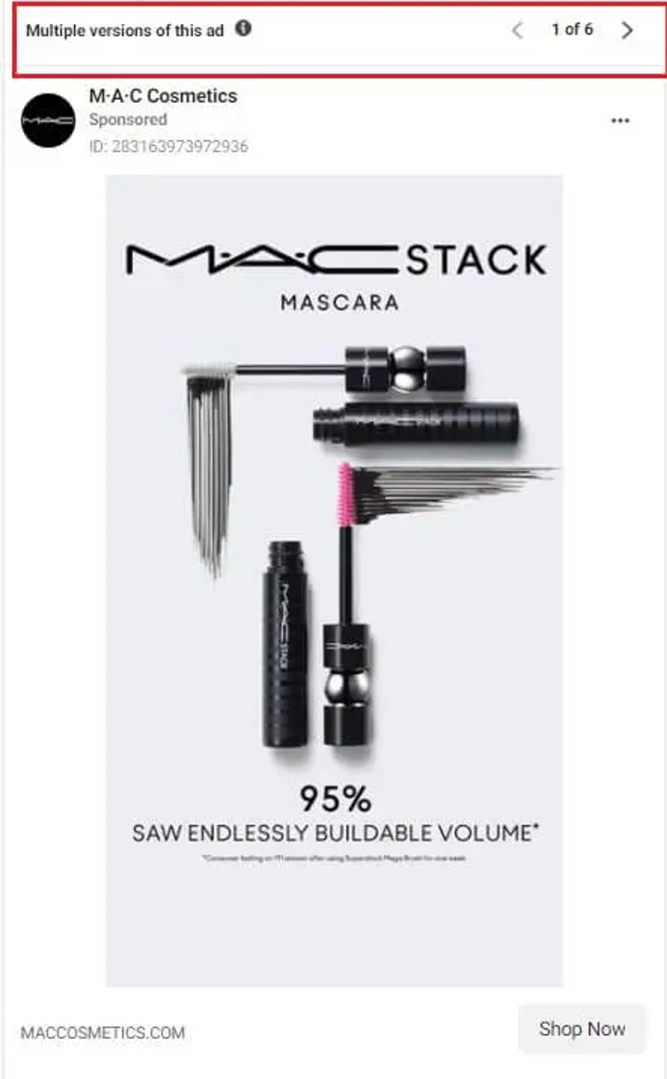
When you experiment with such quantitative testing, you can learn what your audience prefers to see in terms of content. With these observations in hand, you can be sure that your next campaign will do better.
Summary
Ultimately, Facebook ad creatives are meant to communicate your brand to the largest community of people on a social media platform. With the information above and the guide that follows, you are now equipped to make some groundbreaking sales on Facebook.

